
2018 Dulux Colour Awards winners announced
IMG LINK
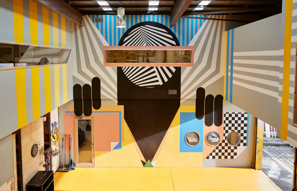
Dulux Colour Awards 2018 – Commercial Interior Workplace & Retail Winner. Abbotsford Studio by MARCH Studio. Photographer: Peter Bennetts
IMG LINK

Dulux Colour Awards 2018 – Commercial Interior: Workplace & Retail Commendation. Williams Burton Leopardi Studio by David Burton Leopardi. Photographer: Christopher Morrison.
IMG LINK
Dulux Colour Awards 2018 – Commercial Interior: Workplace & Retail Commendation – Red Energy by Carr. Photographer: Earl Carter
IMG LINK
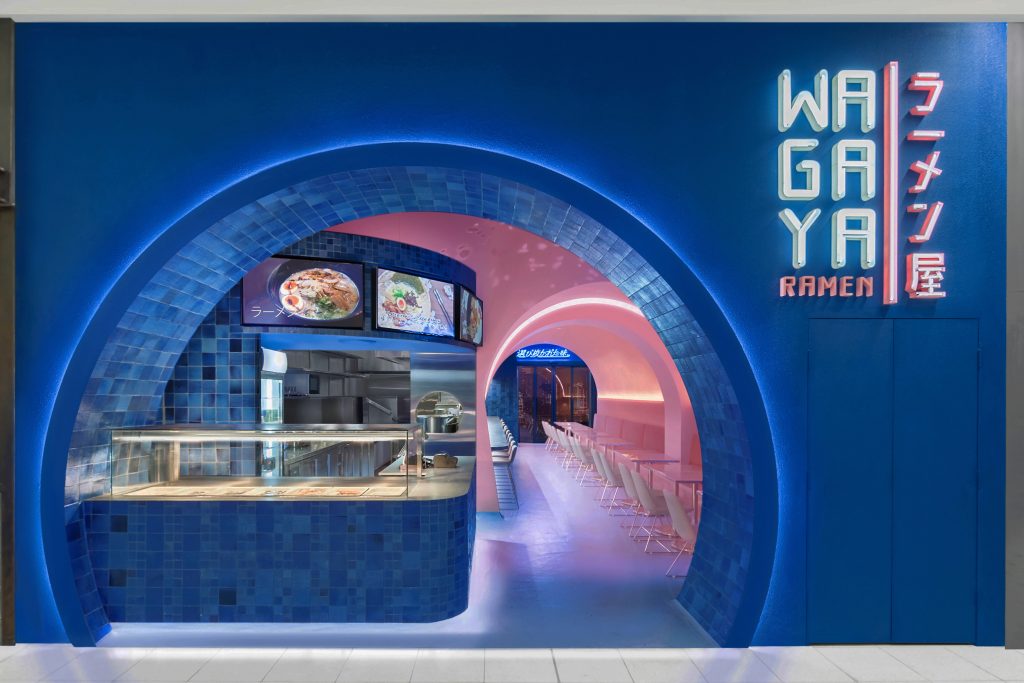
Dulux Colour Awards 2018 – Commercial Interior: Public & Hospitality Winner. Wagaya by Span Design. Photographers: Andrew Worssam & Jayden Huang
IMG LINK
Dulux Colour Awards 2018 – Commercial Interior: Public & Hospitality Commendation. Scape by Foolscap Studio. Photographer: Penny Lane
IMG LINK
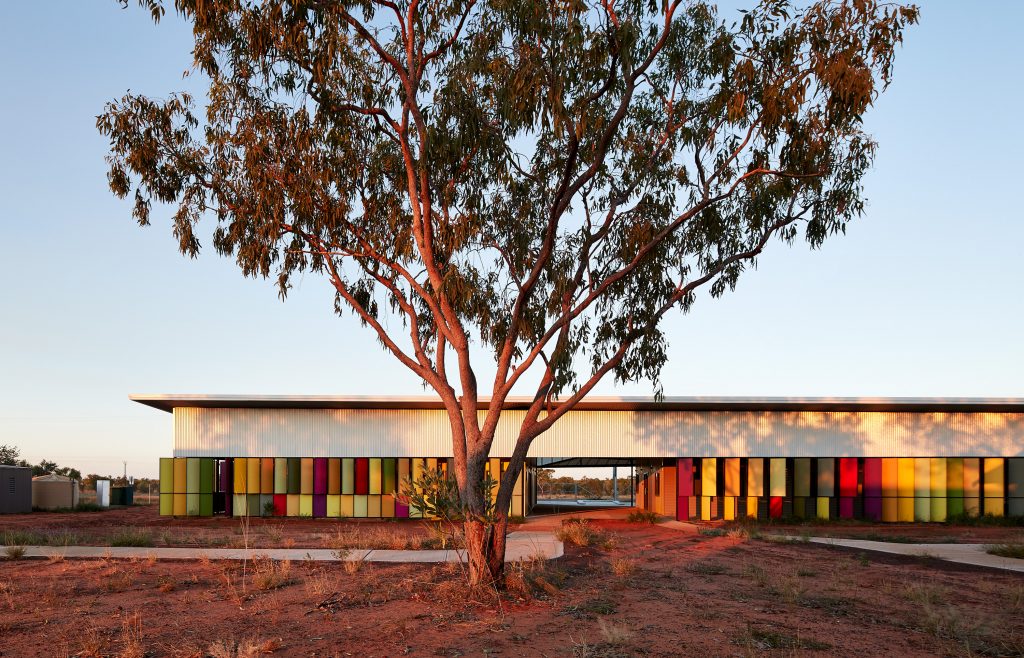
Dulux Colour Awards 2018 – Grand Prix and Commercial Exterior Winner. Fitzroy Crossing Renal Hostel by Iredale Pedersen Hook Architects. Photographer: Peter Bennetts
IMG LINK

Dulux Colour Awards 2018 – Commercial Exterior Commendation. Kangaroo Bay Pavillion by Preston Lane Architects. Photographer: Adam Gibson
IMG LINK
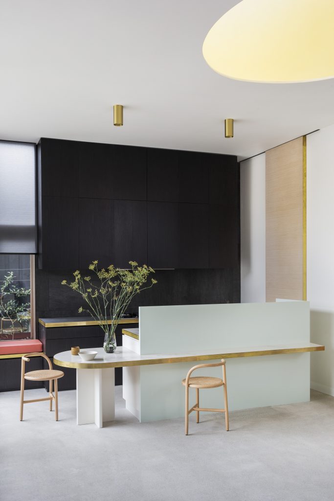
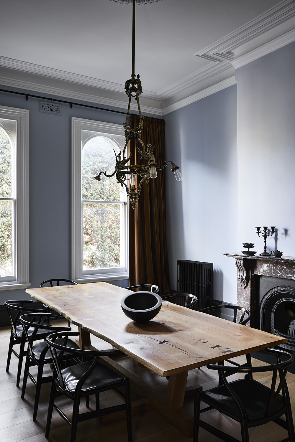
Dulux Colour Awards 2018 – Single Residential Interior Winner. Percy St by Bagnoli Architects. Photographer: Ari Hatzis
IMG LINK
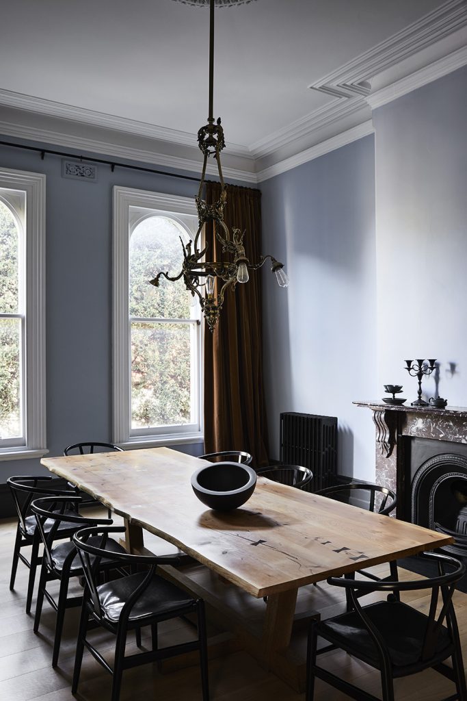
Dulux Colour Awards 2018 – Single Residential Interior Commendation. Elsternwick House by Fiona Lynch. Photographer: Sharyn Cairns
IMG LINK

Dulux Colour Awards 2018 – Single Residential Interior Commendation. Amarelo Terrace by Arent&Pyke. Photographer: Felix Forest
IMG LINK
Dulux Colour Awards 2018 – Single Residential Exterior Winner. Albert Park Curved Pleated Façade by AdeB Architects. Photographer: Jaime Diaz-Berrio
IMG LINK
Dulux Colour Awards 2018 – Multi Residential Interior Winner. North Perth Townhouse by Simon Pendal Architect. Photographer: Robert Frith
IMG LINK
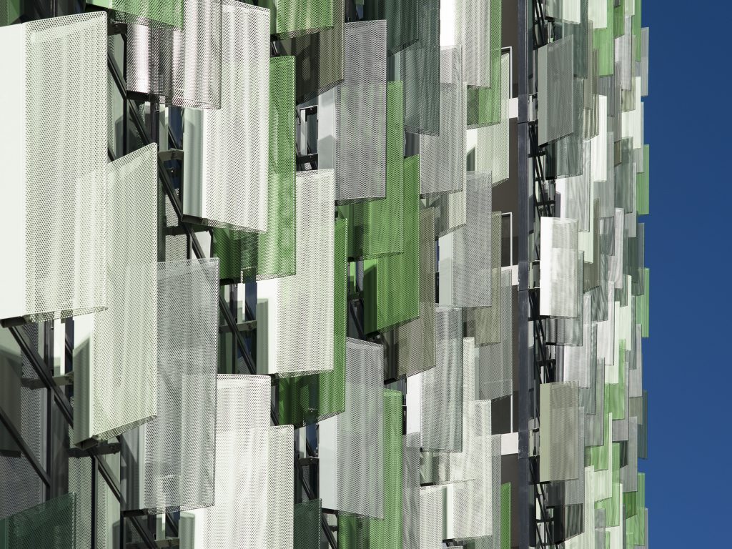
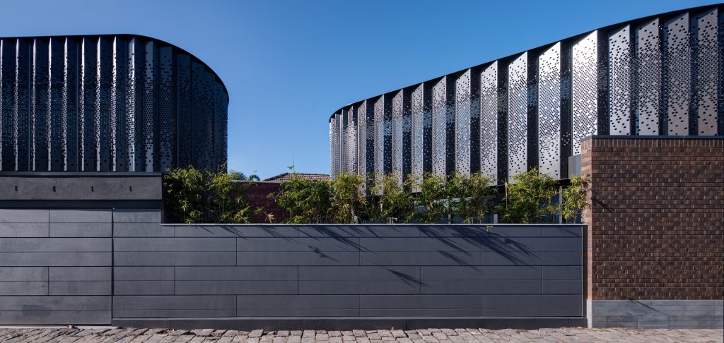
Dulux Colour Awards 2018 – Multi Residential Exterior Winner. 5 Sam Sing Street by Collins and Turner Architects with Environa Studio. Photographer: Richard Glover
IMG LINK

Dulux Colour Awards 2018 – International Commendation. The Family Back by Cymon Allfrey Architects. Photographer: Stephen Goodenough
Courage and innovation typified the inspired use of colour in the winning projects of the 32nd Dulux Colour Awards, announced at last night’s Gala event held at the National Gallery of Victoria. This prestigious industry awards program recognises the most creative and considered use of colour in nine project categories.
Boasting a record number of entries – more than 300 from around Australia and New Zealand combined – this year’s awards highlighted the impact of colour as an architectural and interior design device.
From the warm muted tones of a studio interior to the shimmering metallic finish on a period home extension, the varied application of colour was demonstrated with universal flair, but it was the subtle sophistication of a suite of coloured panels on an outback community facility that drew unanimous applause from the astute panel of judges.
The Fitzroy Crossing Renal Hostel by Iredale Pedersen Hook Architects, was awarded the Grand Prix, as well as the Commercial Exterior Award, for what the judging panel describes as, “the perfect balance of colour and volume. Colour has been used in a meaningful way, adapted to community and worked into the context of it – it’s truly breathtaking.”
Dulux Colour Planning and Communications Manager Andrea Lucena-Orr adds, “It epitomises the value of our awards program, which recognises the most creative and innovative use of colour in the built environment.”
Grand Prix Winner and Commercial Exterior Winner
Project: Fitzroy Crossing Renal Hostel (WA)
Architecture/design practice: Iredale Pedersen Hook Architects
Judges’ comments: “An exemplary piece of architecture, whose impact is heightened, and even defined by, the considered use of colour, the Fitzroy Crossing Renal Hostel is the clear overall winner of this year’s Grand Prix. The nuanced juxtaposition of contextually inspired hues demonstrates an understanding of the strength of colour and its relevance in the Australian landscape.”
“Every colour in this project has meaning and, in its remote environmental context as well as its functional context – that is, the building’s purpose – it is stunning. The architects’ resolved use of colour exemplifies its ability to transform a structure and to generate a sense of place, and the level of sophistication in which it is employed here is exceptional.” – Murali Bhaskar
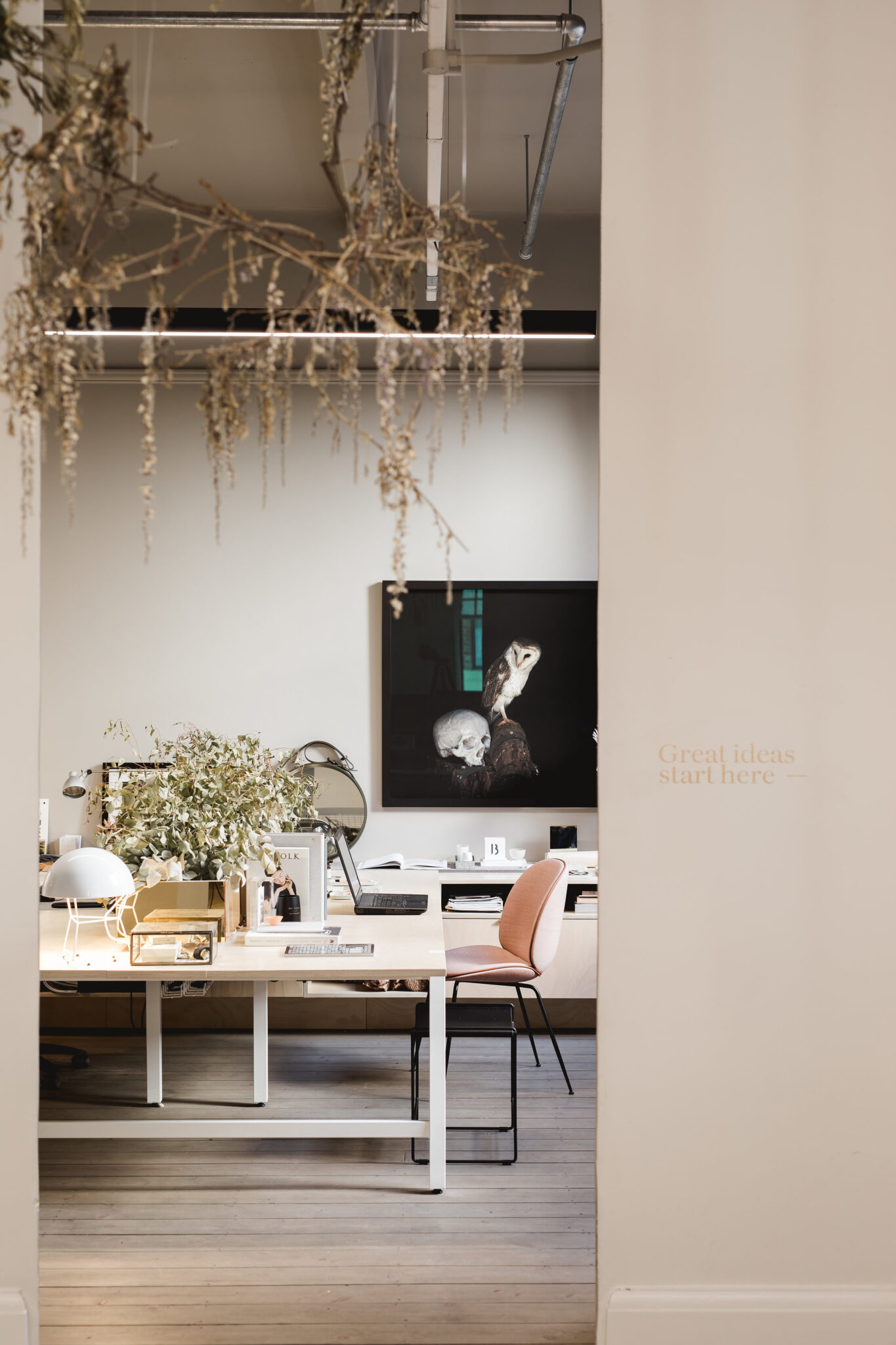
Commercial Interior: Workplace and Retail
Winner
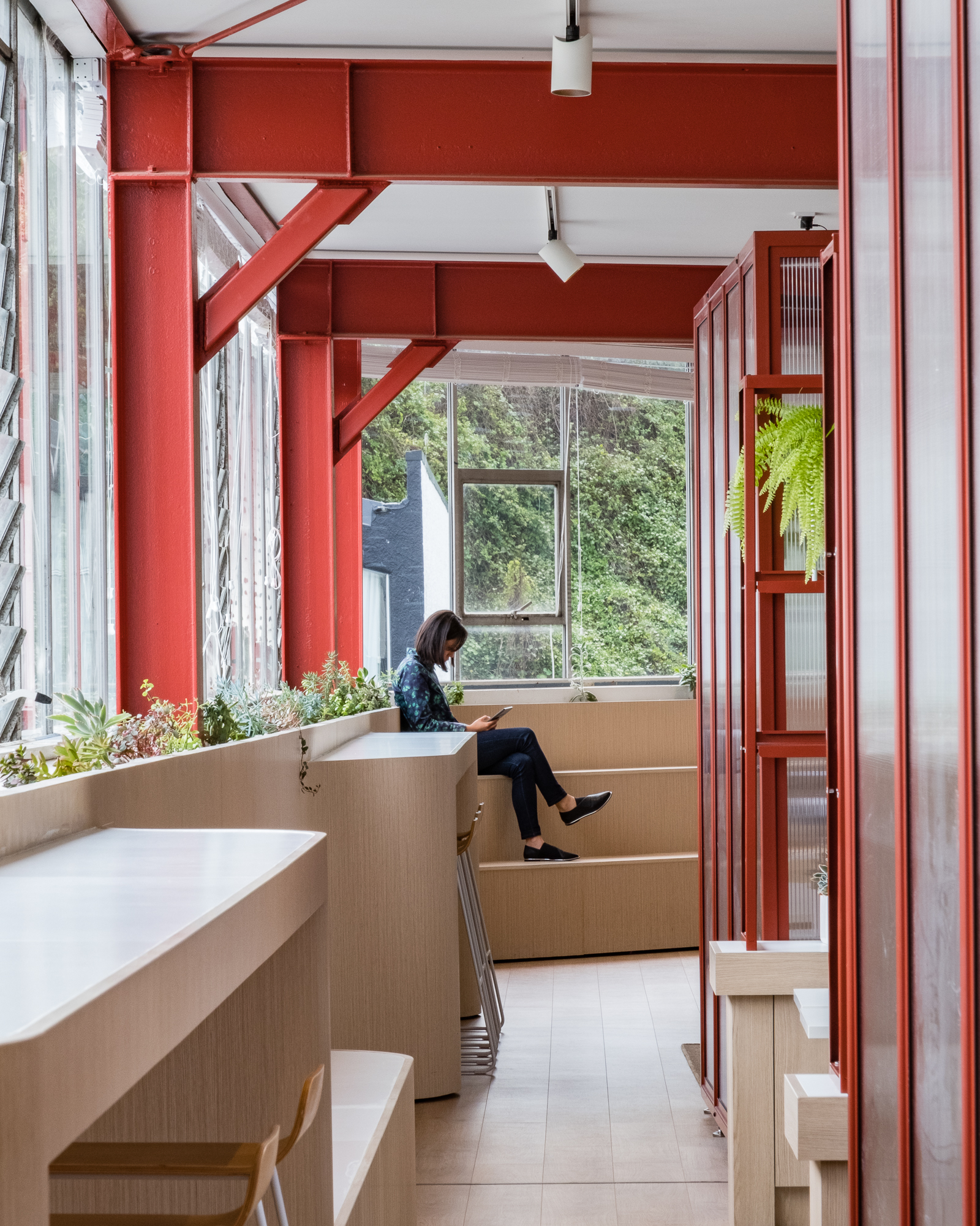
Project: Abbotsford Studio (VIC)
Architecture/design practice: MARCH Studio
Judges’ comments: “In this project, colour has been used to transform an industrial space into something more akin to an art installation. This bold, creative solution demonstrates a courageous design approach, incorporating the proportional and unassuming use of colour. Selected from a diverse range of entries, the studio stands out as an inspiring workplace that truly represents the personality of the company within.” – Miriam Fanning
Commendation
Project: Williams Burton Leopardi Studio (SA)
Architecture/design studio: Williams Burton Leopardi
Judges’ comments: “You would draw breath walking through the entry to this studio. The subtle use of colour is carefully curated, with a muted palette exuding a warmth that is more typically seen in a home or boutique hotel environment. As a backdrop to raw finishes, textured fabrics and timber furniture, it sets the tone for a serene, creative space.” – Miriam Fanning
Commendation
Project: Red Energy (VIC)
Architecture/design practice: Carr Design Group
Judges’ comments: “The depth and balance in the composition of this repurposed factory is masterful, with the considered use of colour transformative.” – Miriam Fanning
Commercial Interior: Public and Hospitality
Winner
Project: Wagaya (NSW)
Architecture/design practice: Span Design
Judges’ comments: “Wagaya transports you to a different emotion and place akin to Japan. It was a standout entry, with clever use of colour and light defining what the space is about, particularly the way colour behaves in hand with lighting. Playing with neon illumination and colour can be tricky, and is difficult to master, but the neon against the selected tones in this interior adds another dimension to the space, creating an ethereal feel.” – Miriam Fanning
Commendation
Project: Scape (VIC)
Architecture/design practice: Foolscap Studio
Judges’ comments: “Colour was integral to the design strategy for this submission, which sees the communal areas of new student accommodation distinguished by bold swathes of bright monochromatic tones. The contrast with raw materials in their natural state is innovative, uplifting and especially welcome in the inner-city context.” – Miriam Fanning
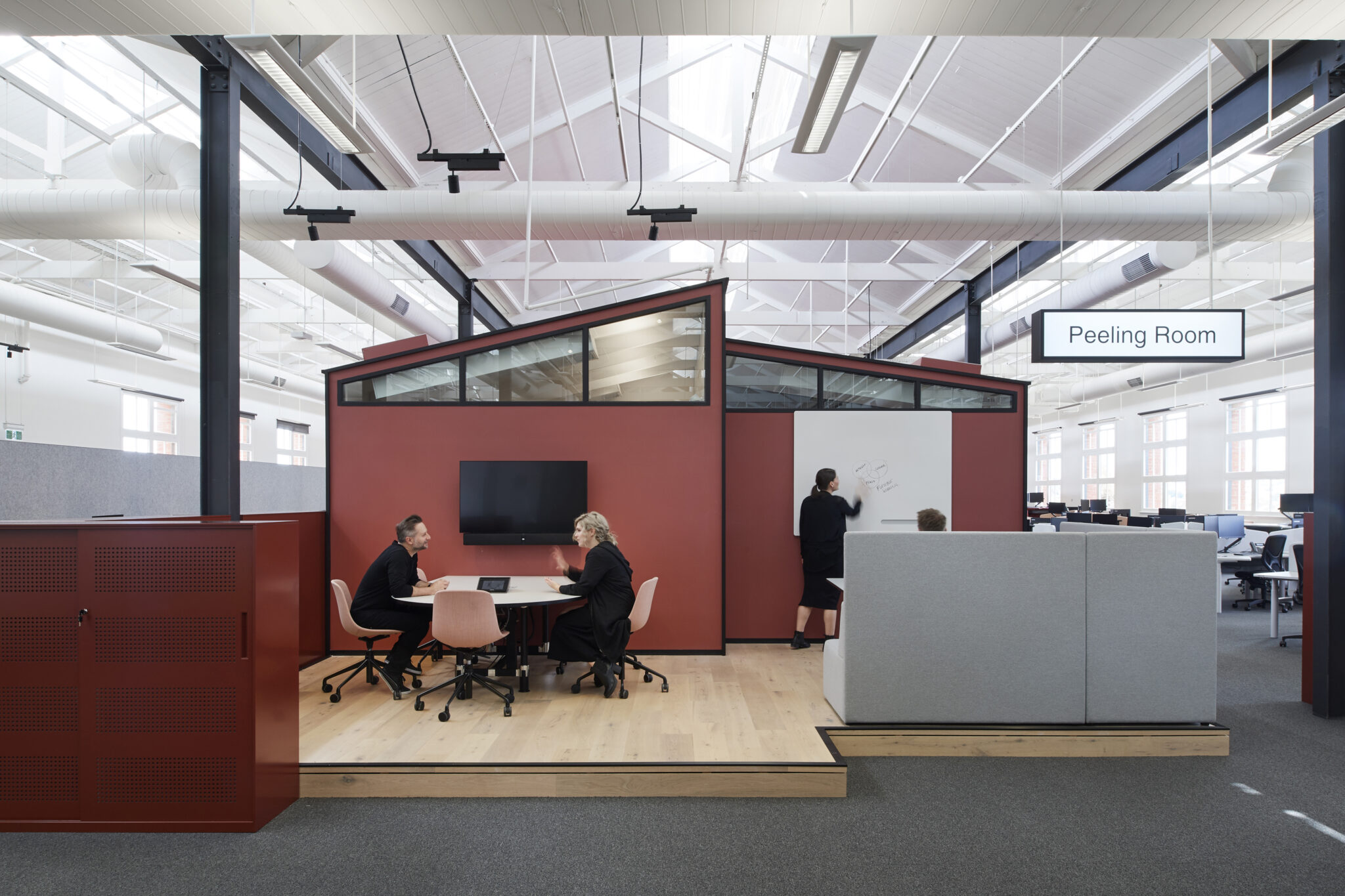
Commercial Exterior
Winner
Project: Fitzroy Crossing Renal Hostel (WA)
Architecture/design practice: Iredale Pedersen Hook Architects
Commendation
Project: Kangaroo Bay Pavilion (TAS)
Architecture/design practice: Preston Lane Architects
Judges’ comments: “This is a beautiful piece of architecture, in form and colour, with the predominant shades subtly drawn from the hues of the surrounding landscape. The muted tones of the ceiling, in particular, are impactful yet understated, softly reflecting the coastal context.” – Murali Bhaskar
Single Residential Interior
Winner
Project: Percy St (VIC)
Architecture/design practice: Bagnoli Architects
Judges’ comments: “Underpinned by an innovative approach to its philosophy and execution, this entry has a beautiful energy and innocence, which captures the essence of what the Dulux Colour Awards mean to us. The exploration of colour is soft and serene, yet commanding, and responds to the architectural form rather than being simply applied to a surface. With greys, blacks and splashes of colour, the interior scheme flows seamlessly to the exterior, demonstrating how the consideration of colour in a design concept can add light and depth to a home.” – David Flack
Commendation
Project: Elsternwick House (VIC)
Architecture/design practice: Fiona Lynch
Judges’ comments: “This classically beautiful and sophisticated residence has been pared back for all the right reasons, and the monochromatic palette fits the architecture: white and black highlight structural elements and openings, while a range of greys tint the walls.” – David Flack
Commendation
Project: Amarelo Terrace (NSW)
Architecture/design practice: Arent&Pike
Judges’ comments: “The considered delivery of the whole project, fully resolved in composition, style and design, is evident here. It wasn’t forced, and results in a timelessness that is heightened by clever layering, materiality of finishes and an intimacy in the design and use of colour.” – David Flack
Single Residential Exterior
Winner
Project: Albert Park Curved Pleated Façade (VIC)
Architecture/design practice: AdeB Architects
Judges’ comments: “This soft, elegant addition to a heritage home demonstrates an innovative use of colour. The application of Metallic Pearl on the serrated façade is extremely brave – it is usually reserved for trims, and small touches – with the result creating a glistening finish of varying tones, depending upon the light conditions, and contrasting beautifully with the red and ochre brickwork. Importantly, it sits comfortably within the broader external landscape.” – David Flack
Multi Residential Interior
Winner
Project: North Perth Townhouse (WA)
Architecture/design practice: Simon Pendal Architect
Judges’ comments: “A clear, concise concept at the heart of this entry separates it from the rest. With bold hues cutting through a base of white, the internal spaces are cleverly defined, while a play of gloss and matt paint finishes adds another dimension to the form. There is no subtlety here; instead there’s an unwavering commitment to the use of contrasting tones to delineate the interior.” – David Hicks
Multi Residential Exterior
Winner
Project: 5 Sam Sing Street (NSW)
Architecture/design practice: Collins and Turner Architects and Environa Studio
Judges’ comments: “This project stands out for a number of reasons. It is an example of repetition done well, with the extensive use of colour serving to enhance the architectural form and be distinctive in its context, without becoming a jarring eyesore. The play of light and shadow, solidity and translucency, across the facade is heightened by tonal variation and depth of colour to create interest in what would otherwise be dull vertical planes.” – David Hicks
International
Winner
Project: Crimson Education Office (NZ)
Architecture/design practice: OPL
Judges’ comments: “This interior takes one colour and uses it with discretion and flair to create definition within the space. The crimson tone highlighting internal architectural elements deliberately contrasts and complements the backdrop of natural materials and shades of white, and the overall effect is clear and cohesive.” – Murali Bhaskar
Commendation
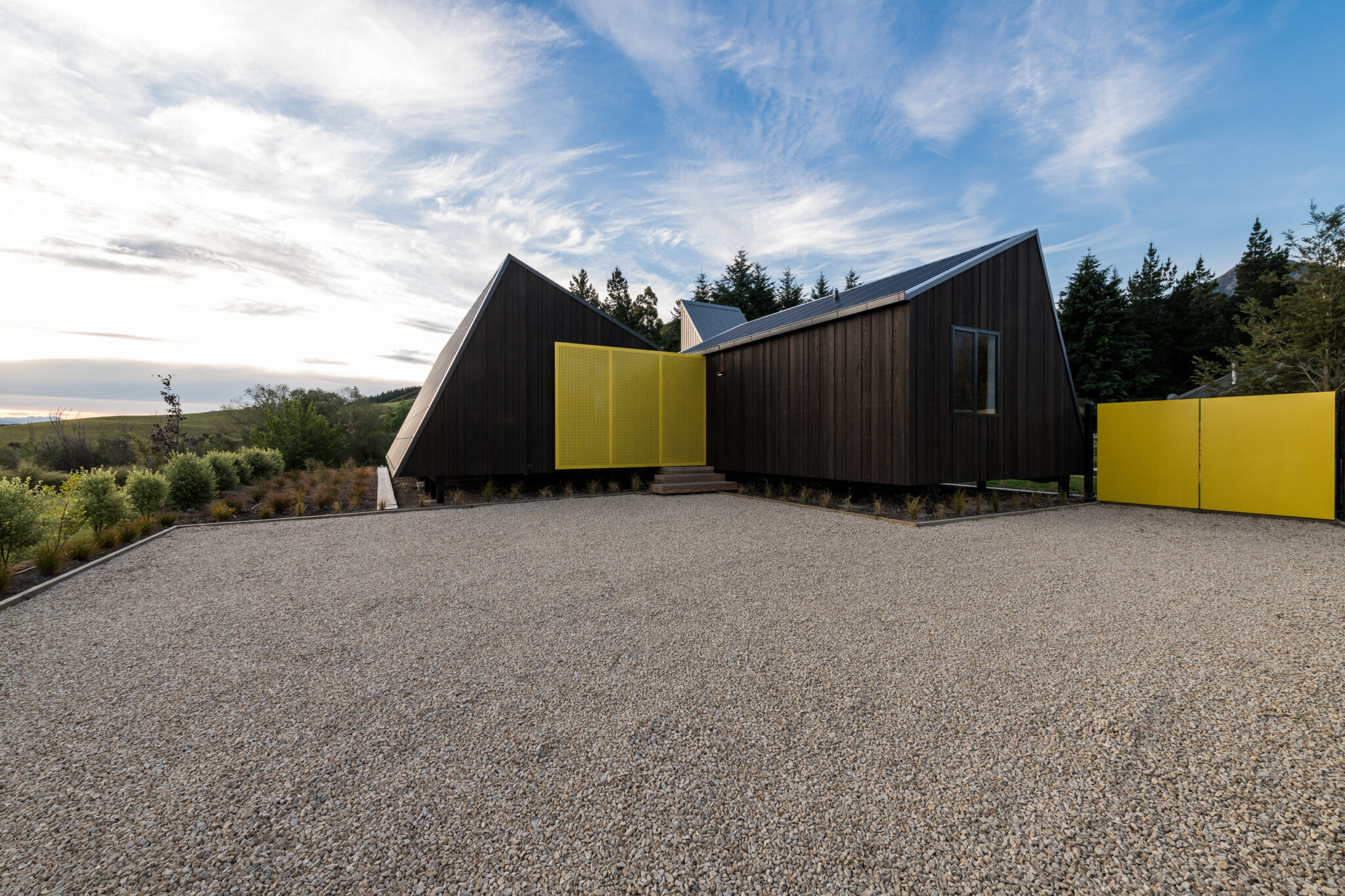
Project: The Family Bach (NZ)
Architecture/design practice: Cymon Allfrey Architects
Judges’ comments: “This bach is a brave little project. Its front elevation is striking and vibrant, and its play of angles and surfaces is continued throughout. Punches of yellow against the raw natural materials are a source of delight, and it must have been a feat to get through the strict regulations of the area.” – Murali Bhaskar
Student
Winner
Project: Arcade St (VIC)
Student: Melanie Modafferi, The University of Melbourne
Judges’ comments: “Through the measured use of colour, this project creates a sense of place and home in an area where immigration is prevalent. Punctuated with colour, the façade treatment is a bold response to this urban context and enhances its surrounding environment. The simplicity of it is beautiful.” – Katelin Butler
Commendation
Project: The Sleeping Body (VIC)
Architecture/design practice: Qun Zhang, The University of Melbourne
Judges’ comments: “In a similar response to community need as the winning project in this category, the use of colour in this proposal generates a sense of soul and an atmosphere of calm. Throughout the form, each colour view is unique and the play of light and shadow is visually striking. It demonstrates how colour can itself become form and illumination.” – Katelin Butler
The 32nd Dulux Colour Awards finalists were judged by; Miriam Fanning – Founder and Principal Interior Designer of Mim Design; David Hicks – Director of David Hicks; Katelin Butler – Editor of Houses magazine; David Flack – Founder of Flack Studio; and Murali Bhaskar – Design Director of Boon Goldsmith Bhaskar Brebner Team Architects in New Zealand.
For more information on the 32nd Dulux Colour Awards, visit dulux.com.au/colourawards.
More green updates