

Breathe X Haymes Paint: Q&A with Breathe Founding Director Tamara Veltre
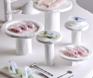
Tamara Veltre, founding director of Breathe shares her vision for curating a paint palette that’s strong on sustainability and durability and perfectly suited to the Australian environment.
What prompted Breathe to collaborate with Haymes Paint on developing the Breathe Palette, and what opportunity did you see to bring architectural thinking into colour specification?
The Breathe Palette really grew from a desire to approach colour the same way we approach architecture — with care, restraint, and responsibility, to create tones that sit comfortably alongside natural materials like timber, brick and stone, colours that feel grounded and timeless rather than trend driven.
How does Breathe approach colour as part of architectural design, rather than simply as a finishing layer?
At Breathe we spend a lot of time thinking about materials – how they age, how they respond to light, and how they sit within the Australian landscape. Paint is often the final layer of a building, but it has an enormous impact on how architecture is experienced. Colour can completely change how a building feels. It can fight with the architecture, or it can quietly support it.
The palette draws on the tones and conditions of the Australian landscape. How did light, climate and place influence the colours you selected?
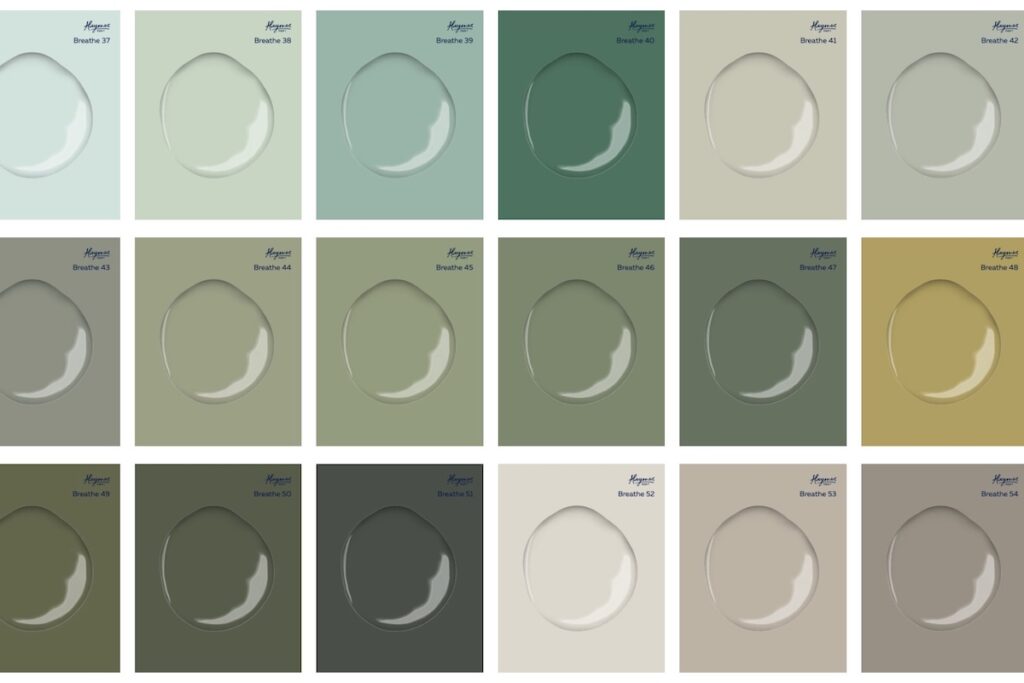
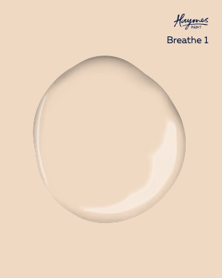
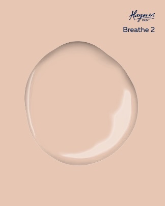
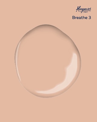
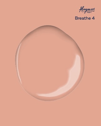
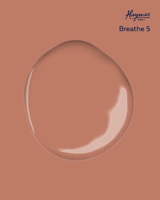
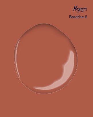
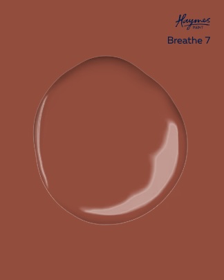
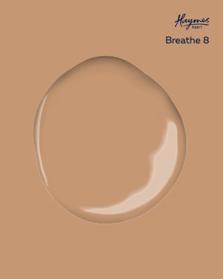
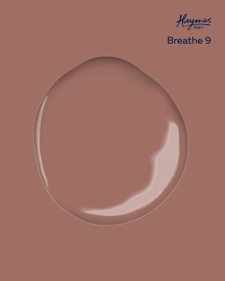
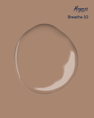
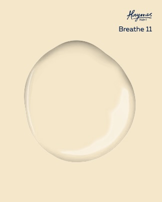
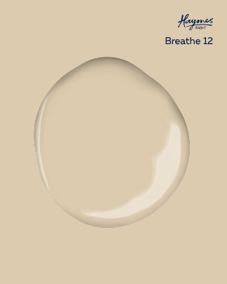
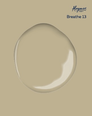
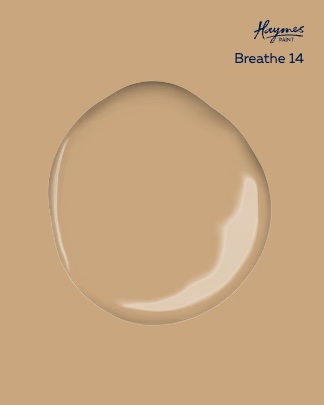
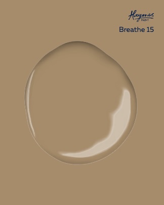
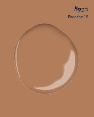
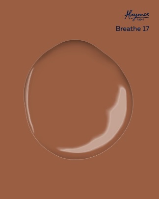
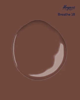
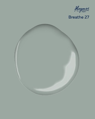
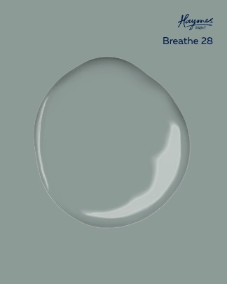
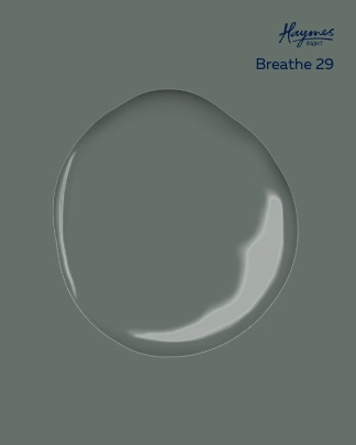
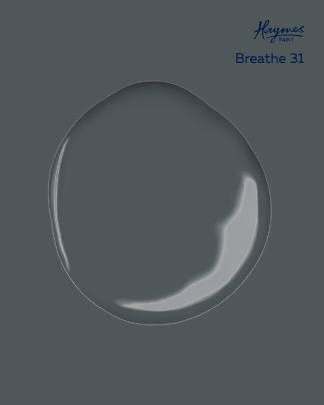
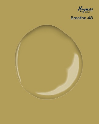
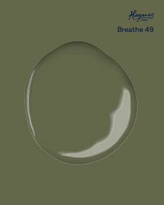
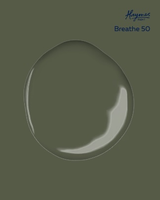
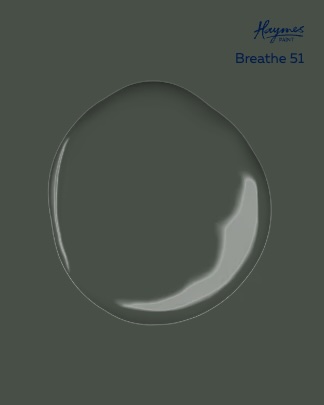
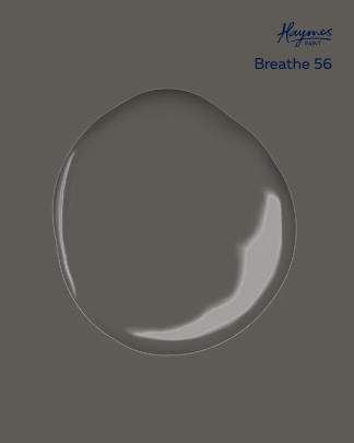
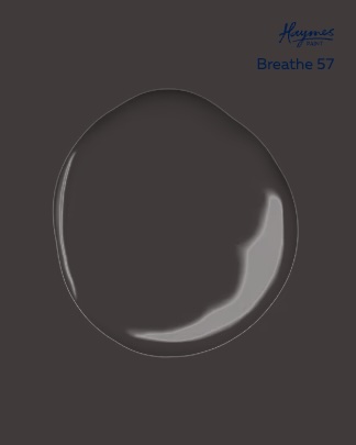
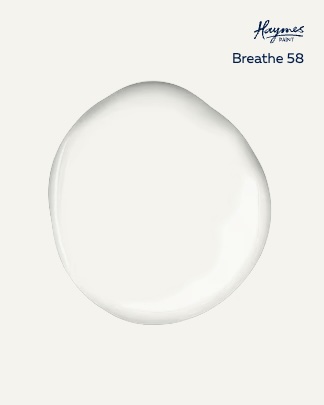
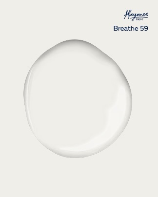
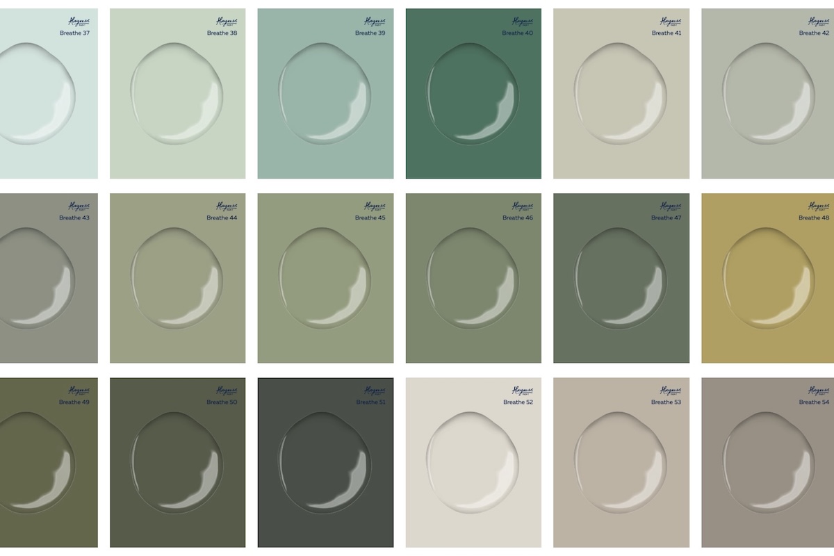
Australia has a very particular quality of light, it’s bright, high contrast, and often quite unforgiving. Colours that might feel subtle in other parts of the world can appear very intense here. When developing the Breathe Palette we were very conscious of how colours perform in that light, both internally and externally. The palette draws on tones that already exist in the Australian landscape: weathered sandstone, ironbark, banksia leaves, dry grasses, coastal driftwood. These colours tend to have an earthy, mineral quality that sits comfortably in our environment and alongside natural materials like timber, brick and stone. Climate was also important. We wanted colours that would remain stable and age well in Australian conditions, where sun exposure can be extreme. That’s why the palette relies on durable iron oxide pigments, which are incredibly stable and allow the colours to retain their depth over time.
Ultimately the aim was to create colours that feel grounded in place and that work naturally with Australian architecture rather than competing with it.
Many Breathe projects prioritise honest, natural material palettes. How were the colours designed to sit alongside materials such as timber, brick and stone?
The palette is inspired by the Australian landscape, the tones of sandstone, driftwood, banksia leaves and ironbark, colours that sit naturally alongside timber, earth and sky rather than competing with them. In our projects we tend to work with quite honest, natural materials, timber, brick, stone, and we’re always thinking about how those materials age and how they sit together over time. When developing the Breathe Palette we approached colour in the same way. Rather than creating colours that dominate, we focused on tones that sit quietly alongside natural materials and allow their texture and character to remain the focus.
Many of the colours have a mineral or earthy base which means they naturally complement materials like timber grain, clay brick, stone and oxidised metals. They’re designed to feel grounded rather than decorative.
We were also very conscious of longevity. Natural materials tend to improve with age, so the colours needed to feel timeless and stable rather than trend-driven.
Sustainability is central to Breathe’s practice. How did environmental considerations influence the development of the palette?
Just as important to us was performance and responsibility. These paints are low or ultra-low VOC, formulated with durable mineral pigments, and manufactured locally in Ballarat. They’re designed to last, to age well, and to support healthier homes and environments.
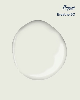
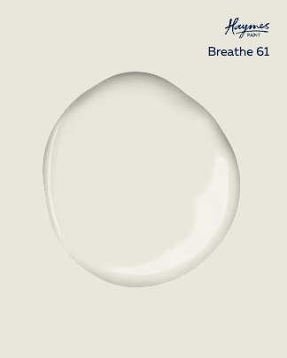
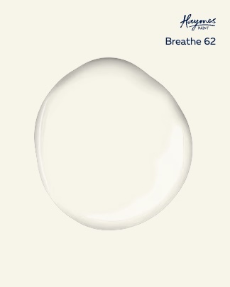
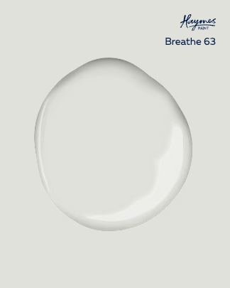
The palette is intentionally limited to 63 colours. What advantages does a more curated palette offer architects and designers when specifying colour?
By curating the palette to just 63 colours, we also wanted to simplify the process of choosing colour — removing the overwhelm and giving designers and homeowners confidence in their selections. We intentionally kept the range to 63 colours to simplify the process of choosing colour and remove some of the noise that often comes with huge paint ranges. Ultimately, this collaboration is about making well-considered design more accessible.
More information: haymespaint.com.au
More green updates