Working Smarter


You never work a day in your life if you enjoy it – so the saying goes. We’ve rounded up a variety of offices that turn working environments into spaces for creativity, collaboration and cohesion.
COOL
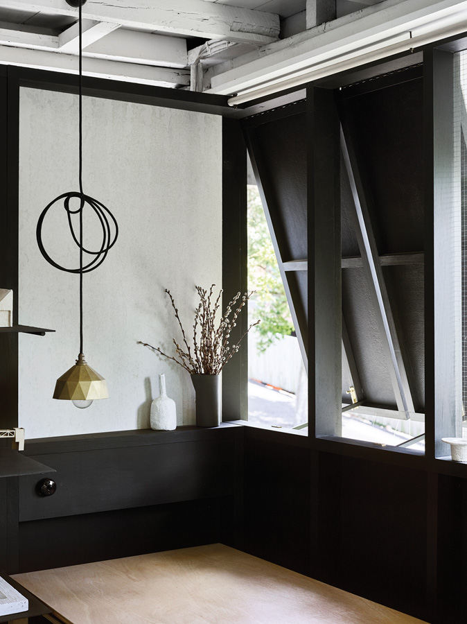
The office of Middle Park House was designed and styled by sisällä for a client who runs a consultancy business from home. Sisällä carefully selected a colour palette that would nurture a sense of calm and consequently encourage productivity – the hue of the walls oozes coolness that is energised by a vibrant watermelon-coloured table. Crucially, the desk area (complete with floor-to-ceiling cork pin-board) is located in a niche with a view to the street, offering the client moments of respite from the demands of the working day. In a most skilful way, this home office is carved into activity zones that spice up the interior program – the table is for meetings; the desk is for solo ventures and the client’s own teak armchairs are positioned for fireside pondering. Sisällä have shown that the stuffy, cluttered home office is a thing of the past – and we are glad to see it go.
CONTRAST
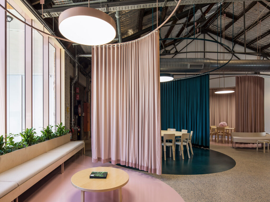
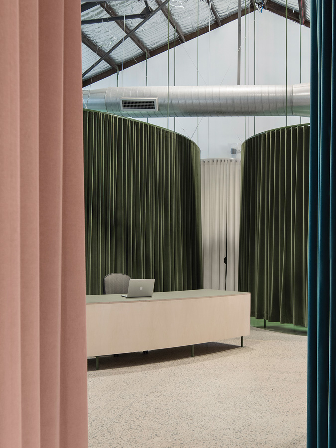
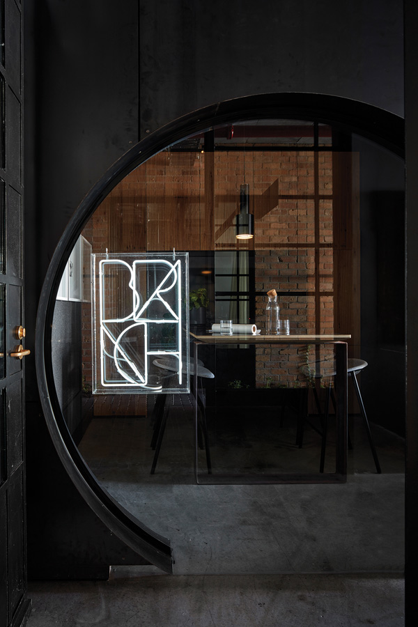
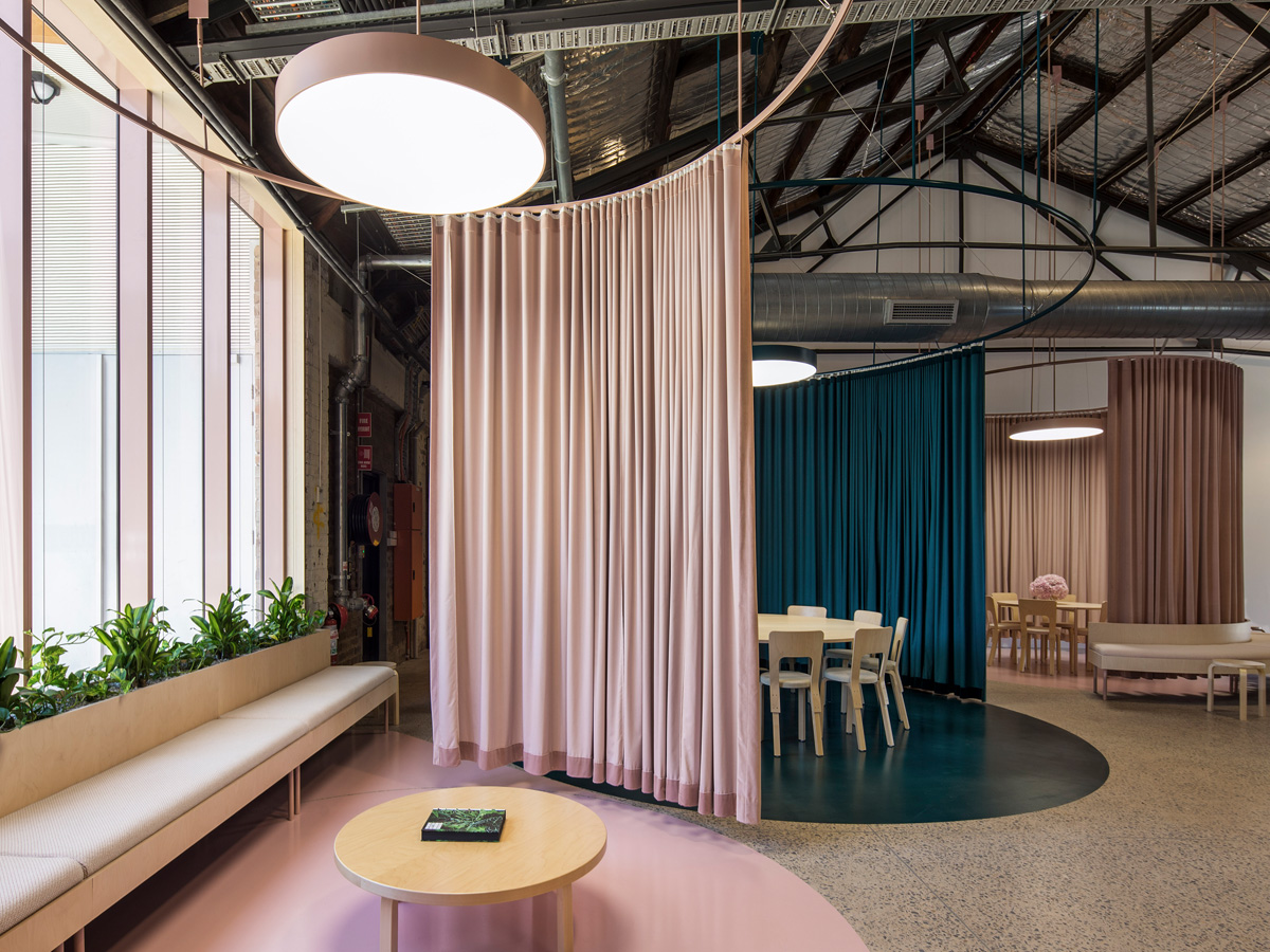
Chenchow Little Architects Rosebery office for lifestyle property group BresicWhitney in Sydney is all about contrasts. Circular pod arrangements of meeting areas and work zones are encircled by velvet curtains; enabling a flexible, adaptive rearrangement of spaces that stands out against the interior warehouse grid. The office layout is calculated: the positioning of these pods creates circulation pathways that draw visitors towards the reception desk. With such a command of movement it should come as no surprise that the office was envisaged as a theatre set – a dynamic, improvisational space without walls that honours the existing heritage building fabric in all its glory. A vintage-inspired colour palette of olive green, indigo blue and blush pink is another tip of the hat to the building’s history.
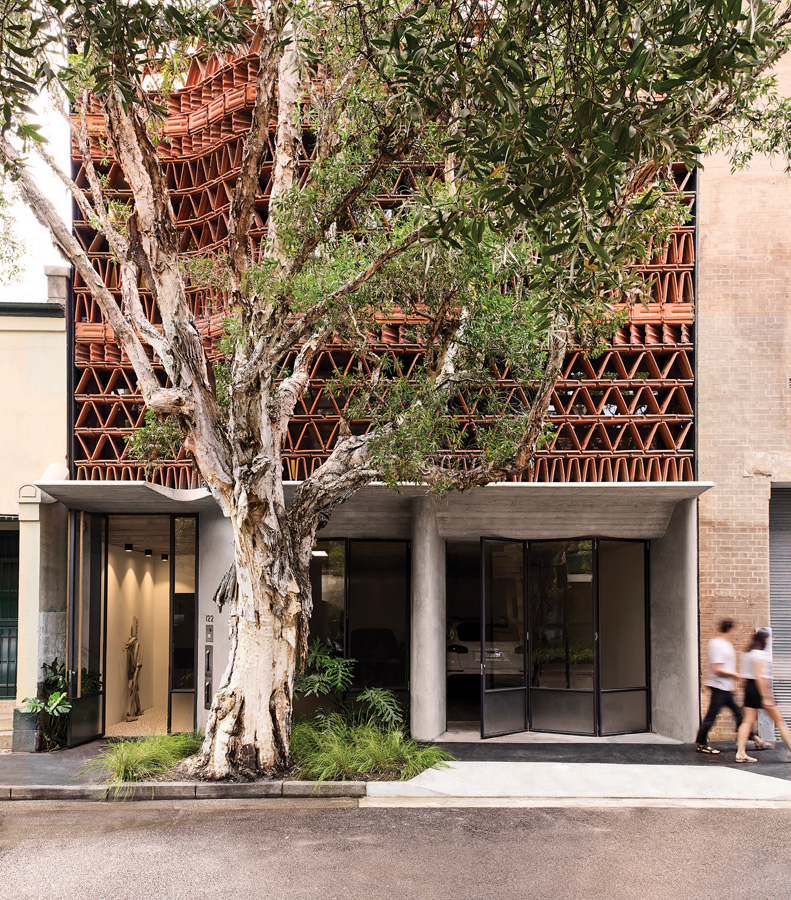
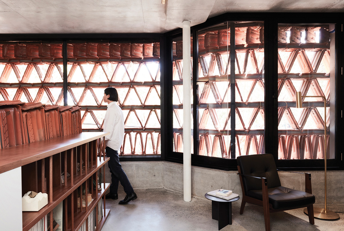
SALVAGED
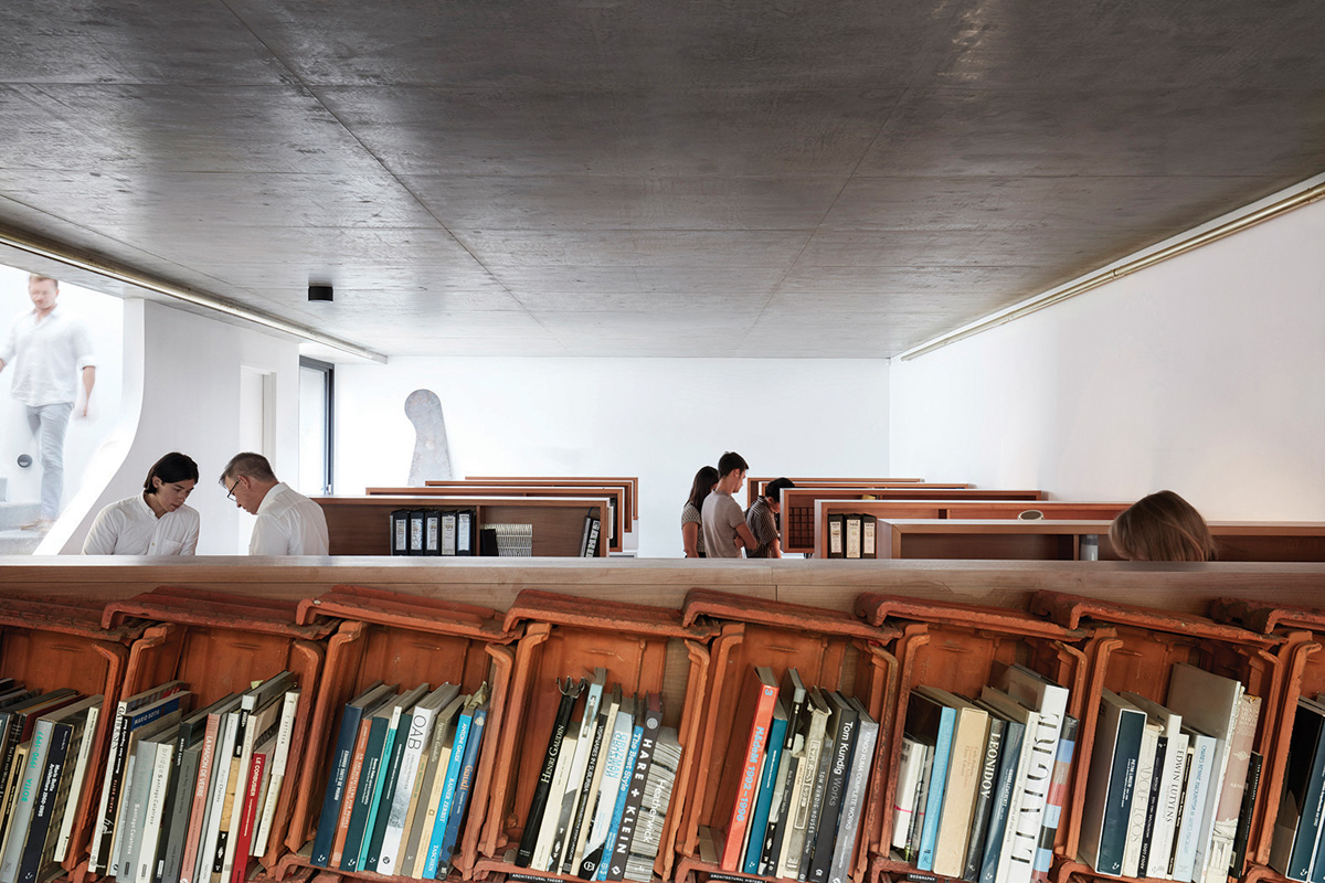
The Beehive, the Surry Hills design studio of Luigi Rosselli Architects, lives up to its name in more ways than one. A collaboration with Raffaello Rosselli Studio, the site was formerly a small car park sandwiched between a century-old brick warehouse and a row of Victorian terrace houses. The hero of this design is the recycled terracotta tile, used as brise-soleil façade to filter the western sun and specially selected to attest to the value of material reuse. Reusing materials like terracotta tiles has nearly zero embodied energy, reducing construction impact while incidentally bringing attention to their natural materiality. Within, The Beehive is structured to stimulate creativity and teamwork – mimicking the dynamic of its namesake. To that end, up-cycled custom-built joinery offers multiple working positions and the main space features two rows of semi-enclosed booths with a linear standing bench for group work.
SANCTUARY
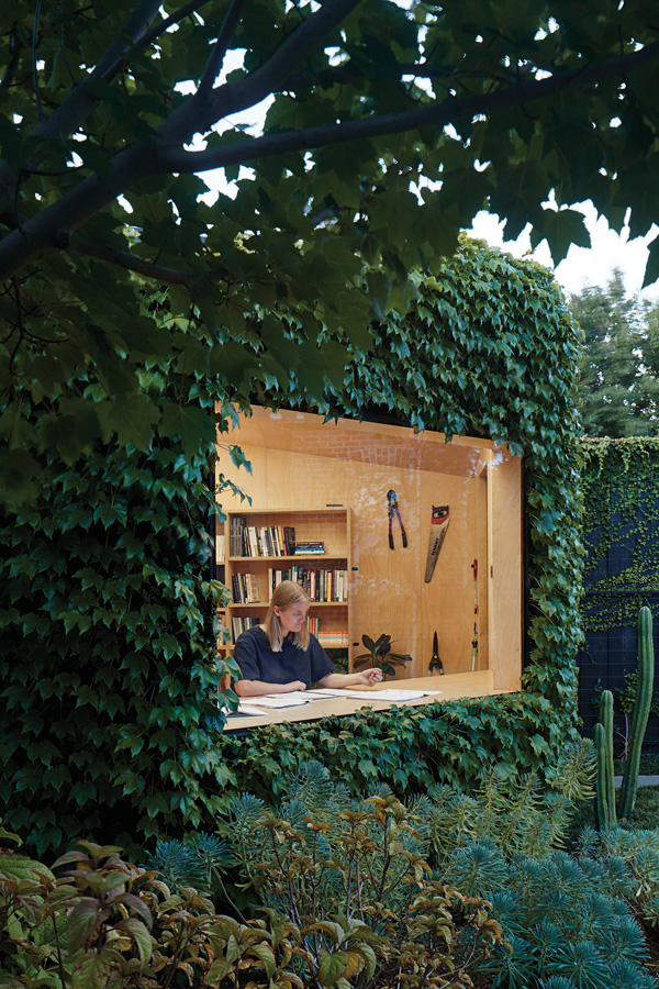
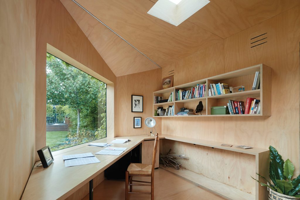
It’s a shed, but not as you know it. The Writers Shed by Matt Gibson Architecture + Design is a creative writer’s isolated workspace in the back corner of the block (and this writer’s fantasy). Located in suburban Melbourne, the Writers Shed melds seamlessly into the garden landscape thanks to a verdant cloak of Boston ivy and plantings developed in collaboration with landscape garden designer Ben Scott. The illusion of camouflage is broken only by a framed window that looks out upon the garden – ideal for gazing out of in a reverie while choosing the right word. The 10-squaremetre interior space is clad in renewable and sustainable plantation-sourced hoop pine ply. Plus, the Butynol rubber membrane has strong thermal qualities abetted by the dense ivy and passive techniques reduce need for mechanical heating and cooling.
FLEXIBLE
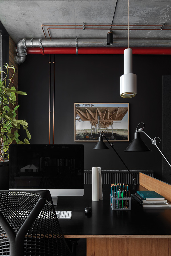
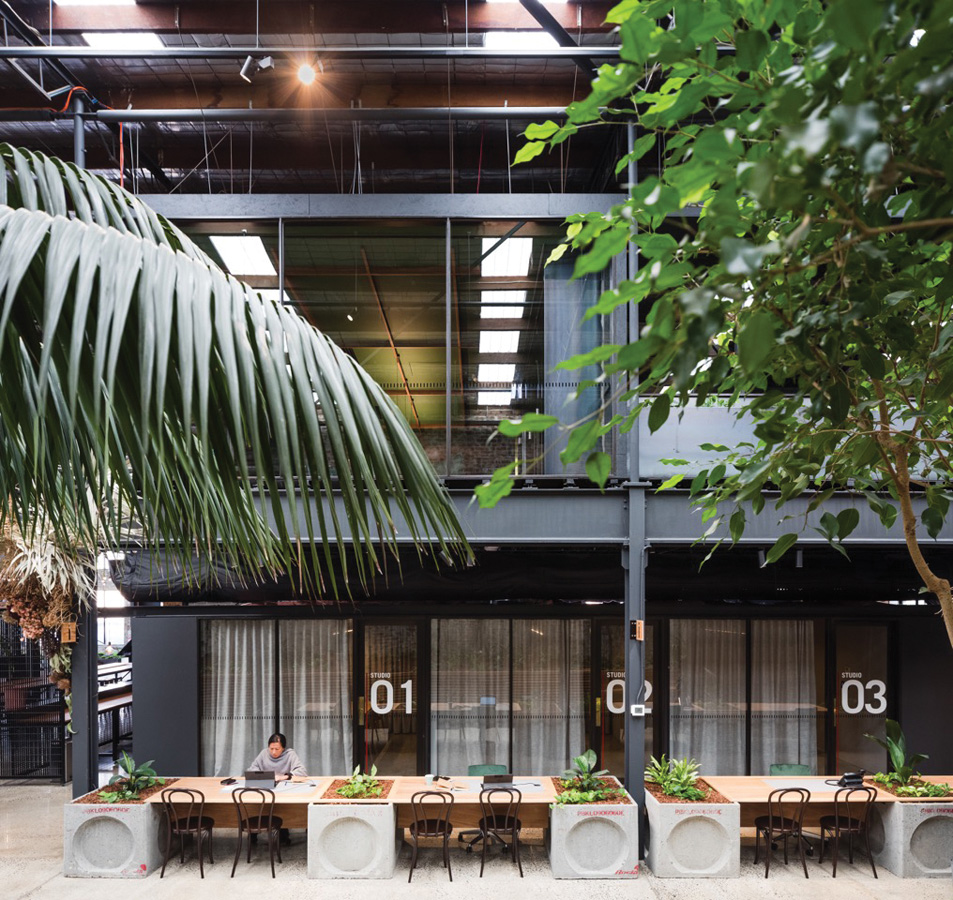
Branch Studio Architects’ office occupies a 45-square-metre shell on the ground floor of Nightingale 1 by Breathe Architecture. Florence Street Studio currently serves two directors, an associate and two full-time staff – but the space is designed to expand to cater to larger numbers. The entry, meeting room and kitchenette are positioned at the northern end of the space, while the workstations are located closest to the southern natural light. A seductive interior palette of raw finishes, including concrete, steel and natural Australian timbers, is complemented by desks and joinery. In an act of foresight, shelving for books and models can be removed to accommodate growth in staff. Among the office’s most remarkable features is the meeting room or “Chapel of Ideas” – a moody and clandestine intervention in the space derived from Carlo Scarpa’s Brion Tomb of 1969–1977 in San Vito d’Altivole near Treviso, Italy. One thing is for sure: Branch Studio Architects have well and truly made this space their own for a long time to come.
PERCHED
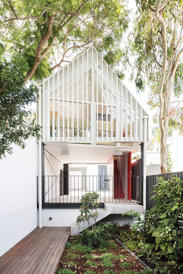
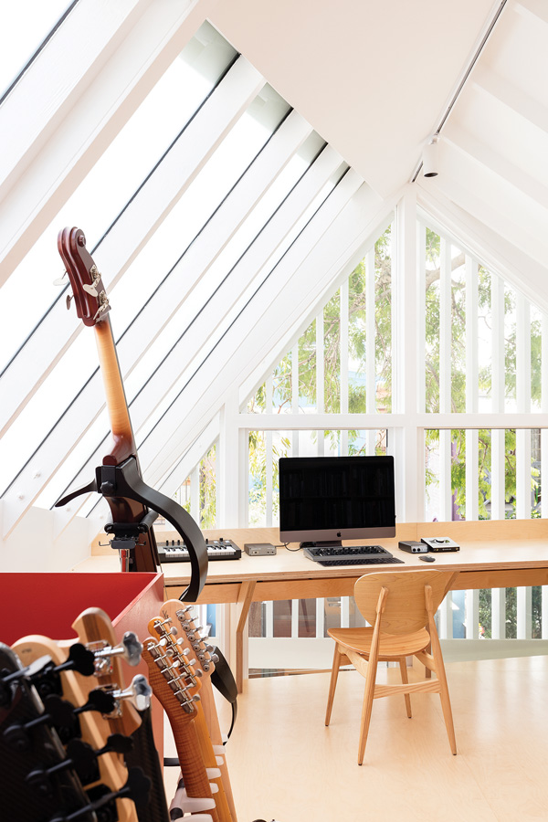
It’s a fact of life that our homes aren’t just for living in; many of us work from them too. The Treetop Studio by Aileen Sage Architects is an example of separating work from home life with finesse. Propped on stilts above an open carport below, the studio consists of a single room for a writer and musician. This design is a response to highly restrictive council regulations imposed upon the tight, inner-city site. The interior is awash with sunlight that streams through exposed rafters and an angled skylight – the latter designed to cut down on one corner in respect for solar access for a neighbour. And of course, the project is dubbed “Treetop Studio” for a reason: large, frameless windows behind the louvred screen invite natural ventilation and impart the feeling of sitting up amongst the trees while one is behind the desk.
TRANSFORMED
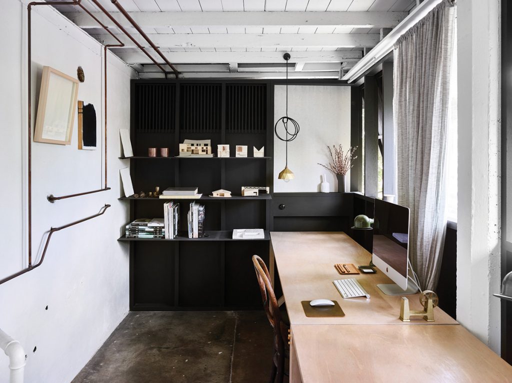
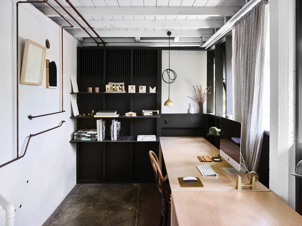
The Red Hill Studio and Shop Front was transformed by zuzana&nicholas Architects into their own office. Reincarnating the undercroft of a Queenslander involved relocating the existing laundry and stripping back the space to its bare bones – but for all their effort, zuzana&nicholas Architects were rewarded. The architects realised that the zero-front alignment fronting a street was reminiscent of a shop and from that, took design cues including large, fixed glazed panels and a tile datum. The studio is 16.5-square-metres and half of the space has been given over to an outdoor meeting room contained by a timber and brass screen that blurs the line between office and garden.
UNCONVENTIONAL
From the outset, Archier knew that Caroma on Collins would redefine retail. The space was designed as an immersive, bespoke customer experience that would “make physical the values and history of Caroma”. With such an atypical response to retail, the working arrangements in Caroma on Collins were bound to be unconventional – and that they are. Casting aside the standard definition of an ‘office’, Archier instead created a café, playground and public meeting space in which up to thirty people work. The vision behind this move was to integrate the designers and customer consultants into the overall experience, ingeniously re-articulating the brief.