Minimum Space, Maximum Potential


The projects proving that creativity and architectural genius know no bounds.
Faced with the pressures of urban density and increasing population growth, we have no choice but to think outside the box when it comes to how and where we live. It is then the task of architects and designers to transform quirky, poky and tricky sites into the dynamic homes we so desperately seek. But despite what their diminutive size might suggest, working with a small-scale project is no simple feat. So what’s the up-side to living in – and with – less?
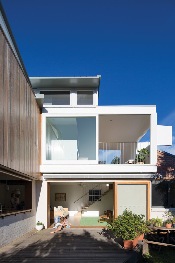
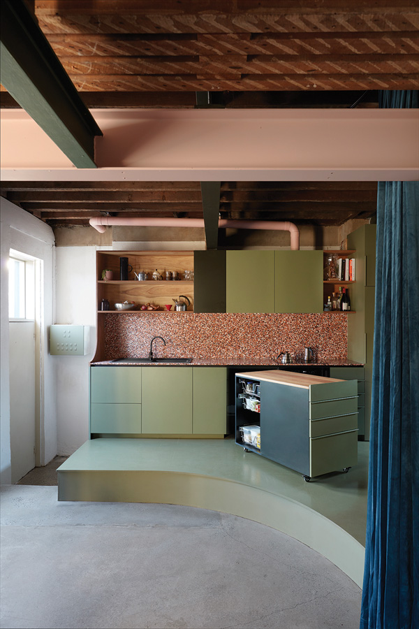
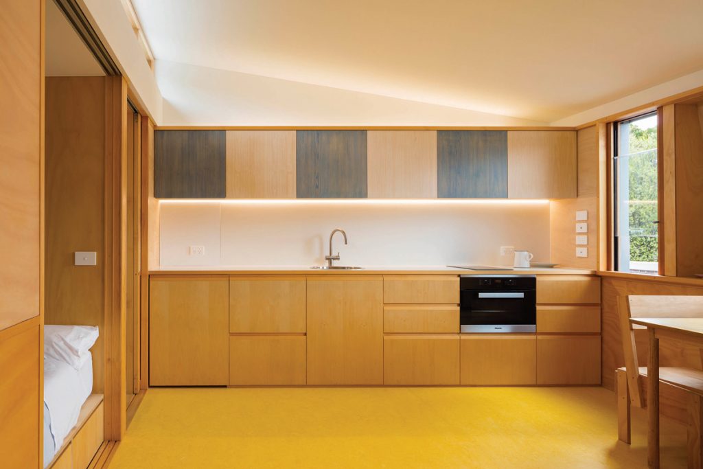
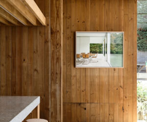
“Small allows more detail, attention and greater overall results,” notes Kurt Crisp, Director of buck&simple. For proof, look no further than casa crisp – a triumphantly composed home built on 180-square-metres of useable land, situated on a battle-axe block surrounded by eight neighbouring properties. And, as if those odds weren’t difficult enough, here’s the brief: to transform an existing 1.5-bedroom brick-veneer cottage into an environmentally conscious home for a family of six.
Buck&simple wasn’t daunted by these challenges, seeing the project’s unusual proportions as an opportunity to champion sustainability and minimise wastage. “Scale is the biggest attributer to carbon footprint,” Kurt elaborates. “Sustainable outcomes are easier to achieve when the volume is limited to what is essential to achieve the brief.”
Retaining as much of the building’s original fabric, for example, most of the existing footings, floors, walls and ceiling, kept material wastage and construction time to a minimum. Environmental efficiency was enhanced by removing internal walls to encourage cross ventilation; the floor was stripped back to concrete, which was then topped and harnessed for thermal mass. Furthermore, the home was carefully arranged throughout, thus avoiding reliance on mechanical heating or cooling.
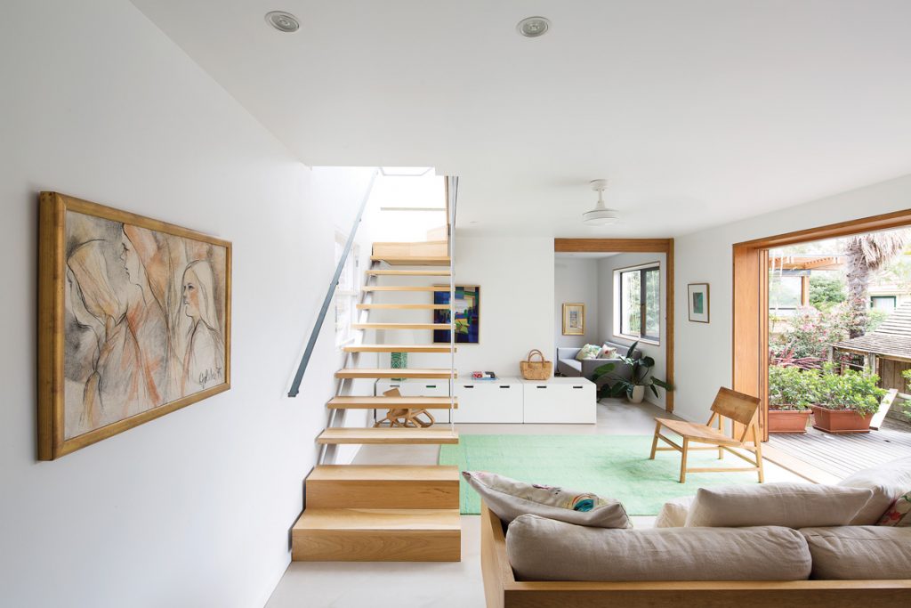
Designing a small space requires precision, planning and utmost focus. “We are always looking at how to get the most out of every design move. Normally there are at least three reasons behind every element or decision,” explains Andrew Milward-Bason, Urban Creative Director. In a project like Ascot Vale House – a 5.5-metre wide site with six-metre high boundary walls down each side – there was certainly no room for error.
This three-bedroom family home is testament to architectural acumen; in the centre of the home, a courtyard welcomes daylight into the living spaces, deftly overcoming the site’s challenging orientation and allowing passive cross ventilation to reach the entire home. Urban Creative boldly reduced the dwelling’s width to one metre alongside this courtyard space, but the advantages it brings to the home were well worth the risk – and, after all, fortune does favour the brave.
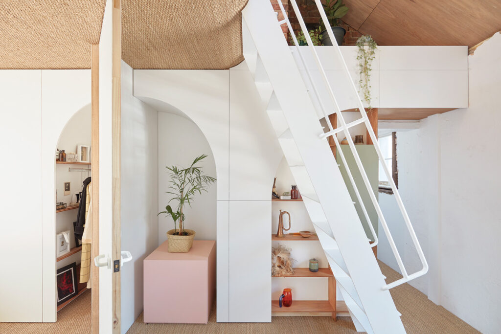
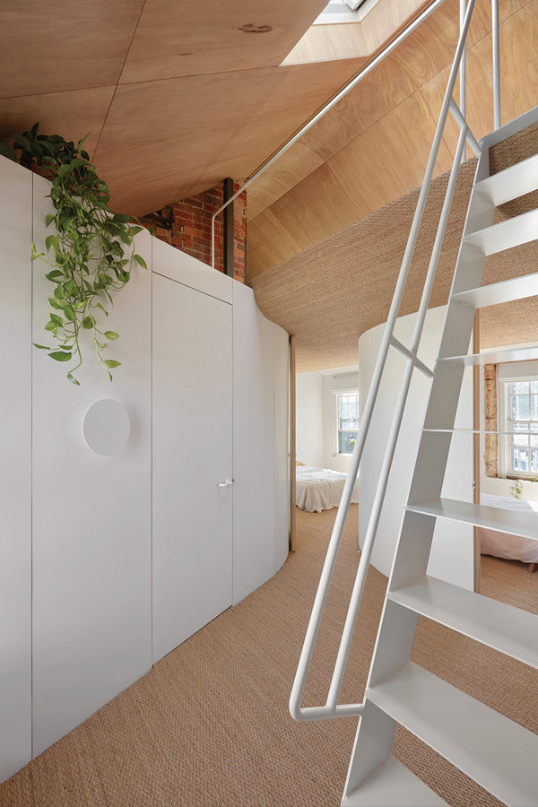
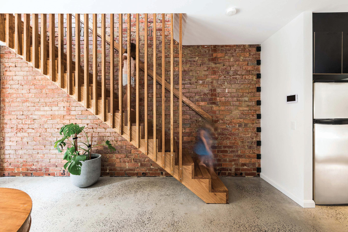
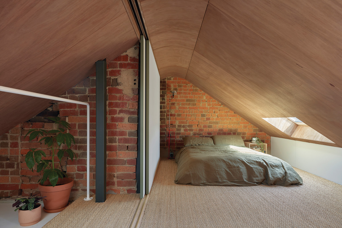
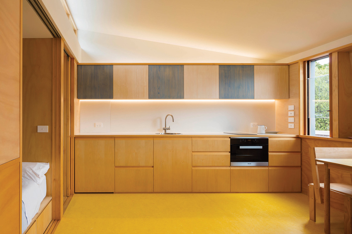
A dynamic small-space project is characterised by masterful niftiness – quick thinking where every nook and cranny counts. The design of Hoa’s House values each and every one of its 104-square-metres. The site was bursting with character – in its former life, it was the 150-year-old Kings Arms Hotel on Queensberry Street in Melbourne. Adding to its personality was the fact that the building didn’t have “a straight bone in it” – a trait that ioa-studio embraced.
“The curved walls allowed the small and awkward existing title to be divided in plan, without making any space feel cramped,” Amy Bracks of ioa-studio elaborates.
One of the building’s more recent incarnations was as an office. Upon peeling back the dull interior layers, treasures ranging from old bricks, massive bluestone lintels and a gable roof were uncovered. They even dug up some old candle holders. “We realised that by exposing as much of the original, the new home would revive aspects of the old pub/hotel it once was,” Amy shares. Hoa’s House goes to show that in small spaces, wonderful results are achieved when one goes with the flow.
The result of this loving makeover is a highly personalised home that pays respect to its history while being daringly modern. “The design worked in conjunction with the client’s collection of mid-century furniture and personal relics by creating many small nooks and hidden spaces [for] them to be exhibited and stored,” Amy details.
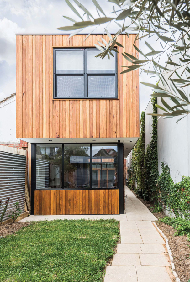
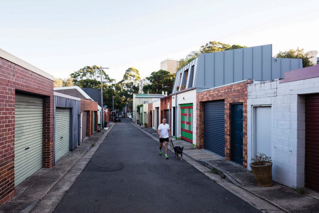
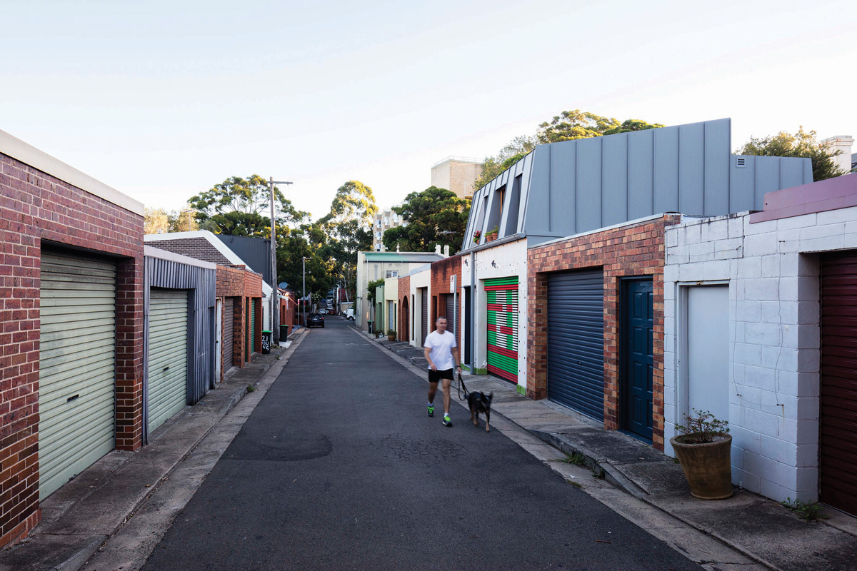
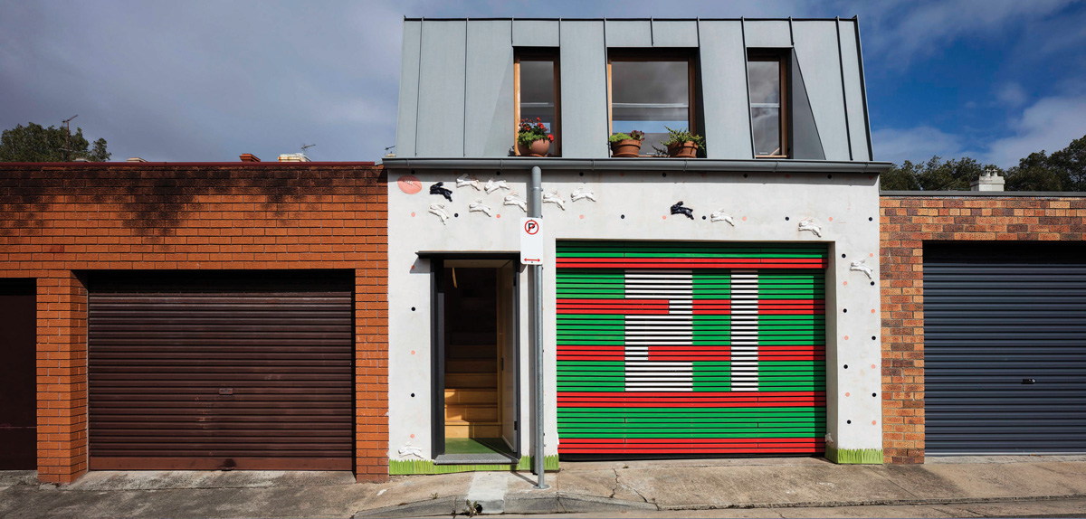
Design of small spaces is often characterised by architectural bravery. Laneway Studio by McGregor Westlake Architecture sure fits a lot of pluck into its 25-square-metre footprint. This project was conceived as an alternative, sustainable model for the laneway-studio type; a dwelling increasing in popularity in metropolitan Sydney. “The laneway studio is an important layer of infill within the fine grain [a network of street and lanes]. It is like another complementary layer, over and within the existing housing fabric,” observes Peter McGregor.
There were several hurdles to be tackled in this design. Laneway studios, they found, can result in inadequate passive surveillance, privacy conflicts and overshadowing of neighbours. Add to that the reluctance of the local council and it’s easy to see that the architects had their work cut out for them. “We got [the project] approved because we engaged council in a dialogue and because we had a clear set of principals about the lane, the neighbours and amenity,” says Peter.
Every detail of Laneway Studio was diligently resolved to maximise space. The mansard roof form permitted building from boundary to boundary; the stair was placed to define the larger volume to the street and the lower volume to the rear which contains the bathroom and bedroom nook; the interior palette is in tonal harmony. This studio advocates for a more efficient lifestyle, and an environmentally conscious one too – the largely Queensland hoop pine ply-clad space doesn’t need air con. “The lanes have the potential to be transformed positively by this increase in density, height and use along their length – if done well,” Peter notes.
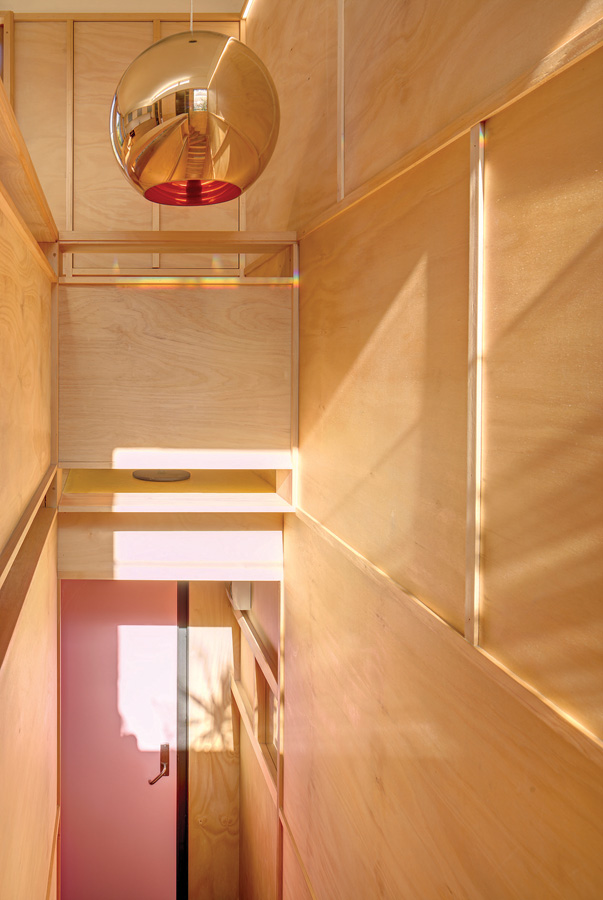
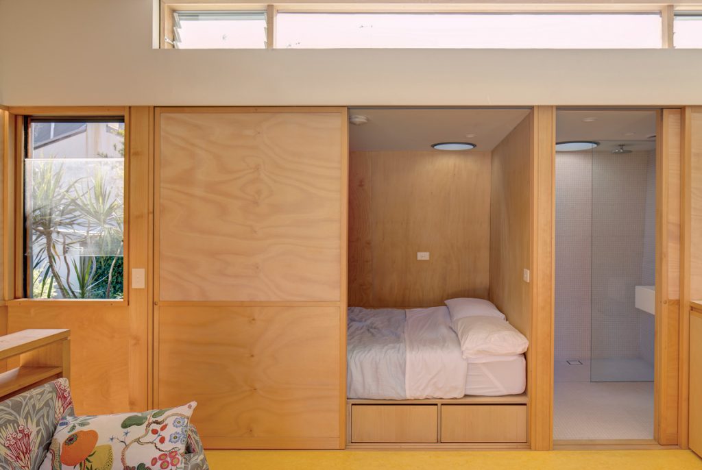
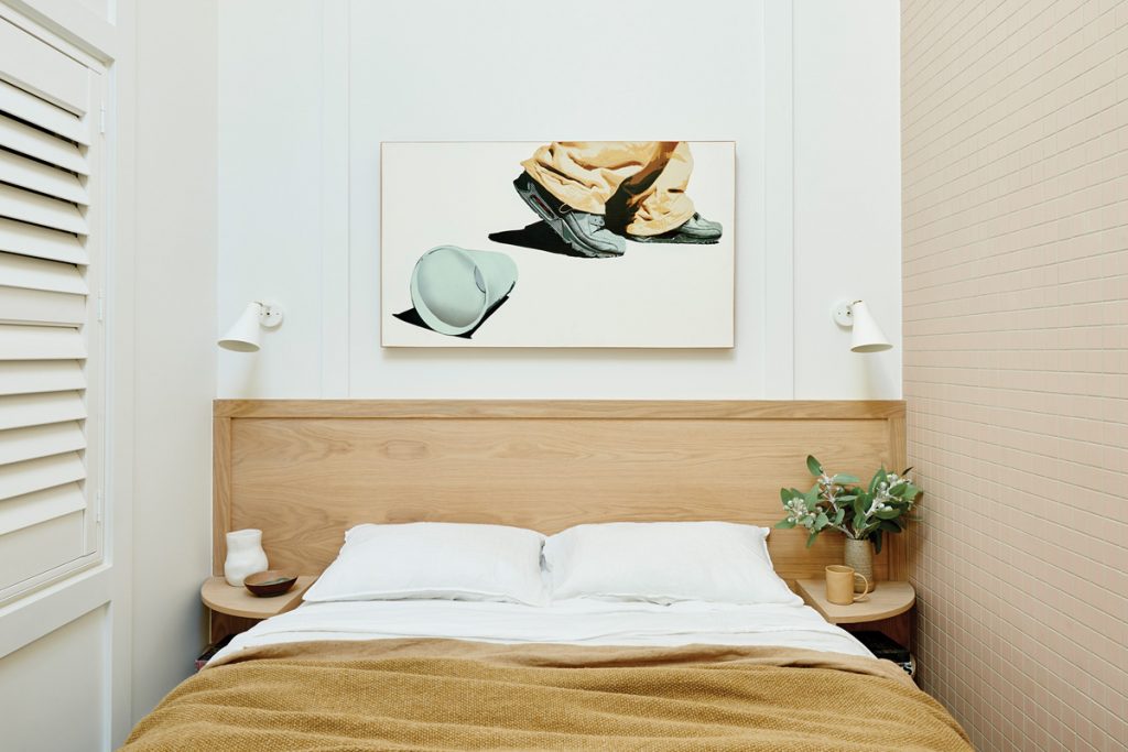
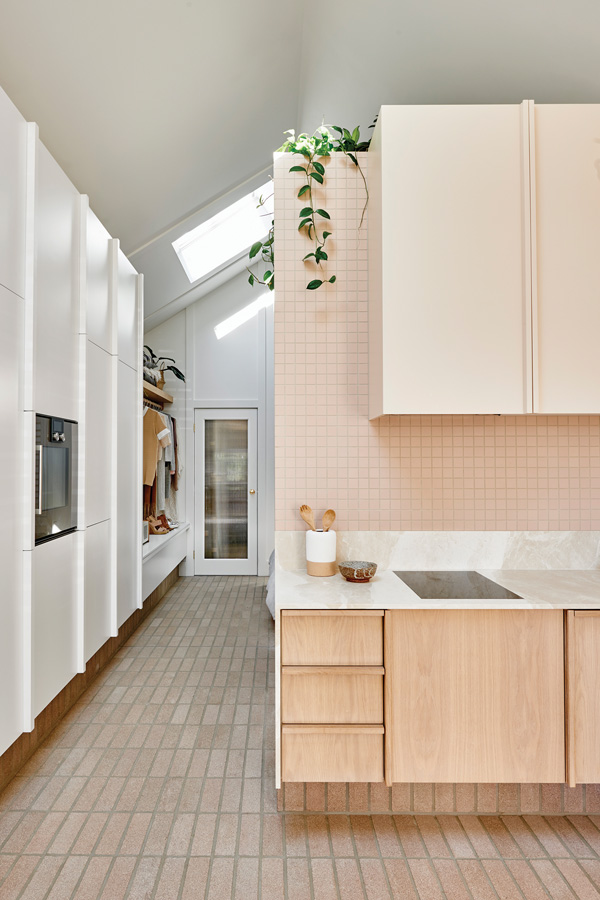
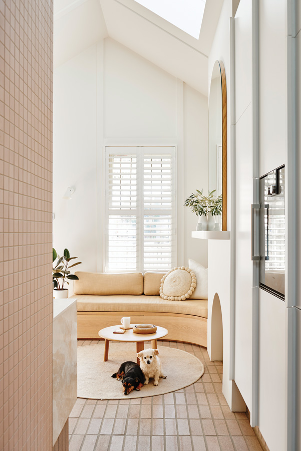
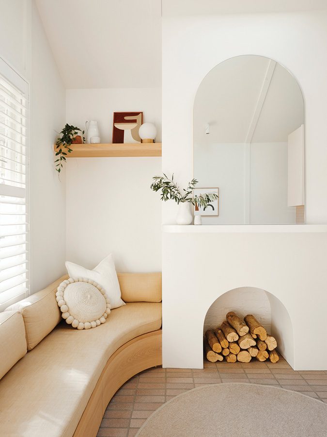
Canning Cottage, a 32-square-metre worker’s cottage originally built in 1874, deserved nothing less than perfection. Melbourne-based interior design practice, Bicker, found working with the cottage’s tiny footprint provided a chance to reflect. “It challenged us to think about the way we could live, rather than the way we currently live,” explains Jenna Densten.
The materials and finishes in this sophisticated transformation ensure that the space feels light and spacious, despite being just four-metres wide and eight-metres long. Peachy tiles enhance soft timber moments and white walls, a union enhanced by cameos of green lusciousness by plants. “Good design can minimise the need for excessive space and ensure your home is used to its full potential, no matter the size,” Jenna summarises. We’re inclined to agree.