At Ease


A small red brick home is transformed with a series of beautiful, linked and seemingly simple boxes deliberately at odds with the original house.
What do you do when the red brick house you live in, built in 1921 in a great urban location, is already too small – and you have a little one on the way? Further, you desire internal courtyards and a contemporary addition, very different to the façade from which it projects. There is also not enough space to build extensively behind the house, and the land drops away by several metres. Well, you address all those challenges with a series of beautiful, linked and seemingly simple boxes, with internal and external views.
Nicola and Matt met architectural firm Archier (Josh FitzGerald, Chris Haddad and Chris Gilbert, and co-director and landscape architect Jon Kaitler) to talk about their requirements. First, the original kitchen and bathroom were reconfigured to allow the clients to live in the house during building work. Then the brief for the addition was clarified: to take advantage of the northern aspect and include light wells; to create a private at-home retreat; to make a kitchen in which to regularly feed and entertain a large, extended family; and to “ground it on the site”.
There was a need to display several large and much loved artworks, and to make one of the new spaces a cosy and semiprivate nook. Matt required an externally accessible space to store bicycles and there was a clear desire to provide enclosed, turfed spaces for a growing child. Archier’s approach to design meant the landscape was considered very early, to ensure “site grounding” was integrated in the spatial programming. Nicola also had a clear vision of the respective spaces and she undertook materials’ research to project-manage the fit-out.
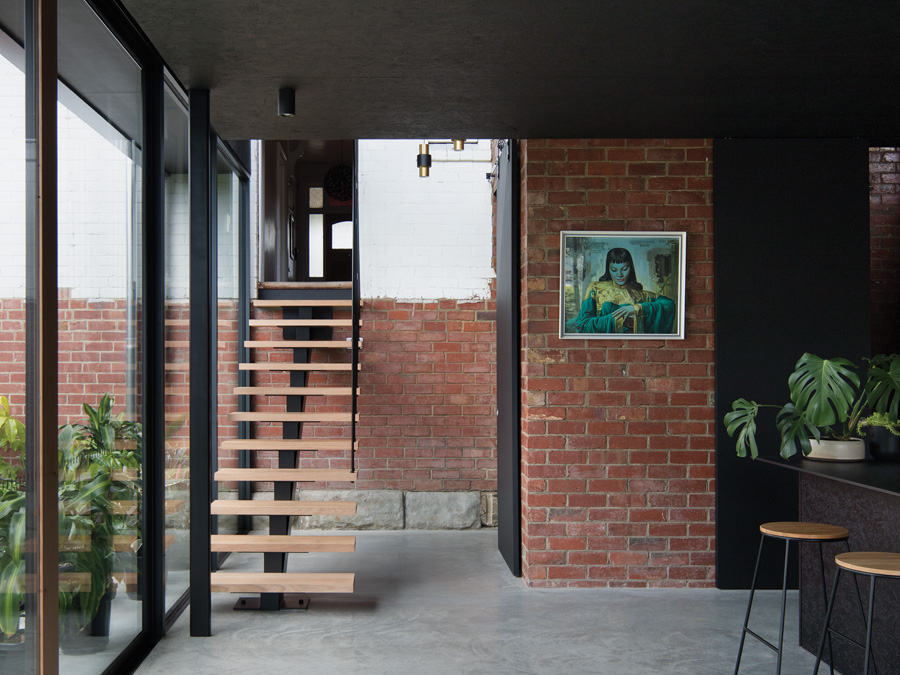
The 90-square-metre addition is connected to the house’s original hallway by a floating steel staircase, lit on one side by a trio of pendant lights and on the other by a courtyard – one of the “light wells” requested by the clients. The height difference between the hallway and new floor level provides a theatrical sense of entry and the differentiation is also marked by the remnant white-painted external wall of the house, showing the outline on an old lean-to.
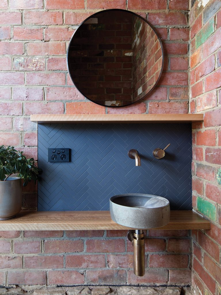
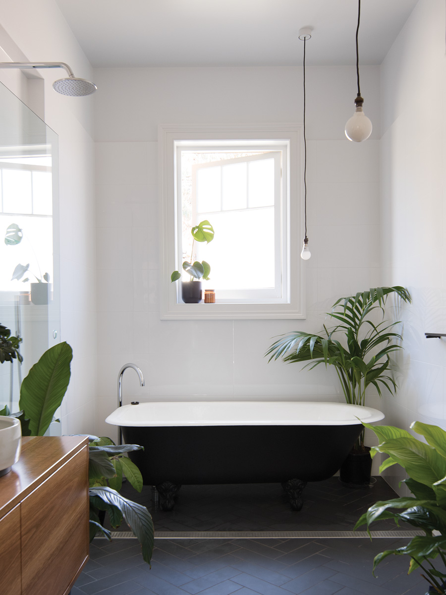
Tucked beside the stairs, in the footprint of the old lean-to, is a new toilet with a double-height ceiling and a dramatic, hung sliding door. Adjacent, and equally private, is a similarly ceilinged butler’s pantry/laundry, lit by the original lean-to window. The bricks that line the toilet and pantry are reused and sealed with a satin glaze, which helps bounce light into these secluded rooms.
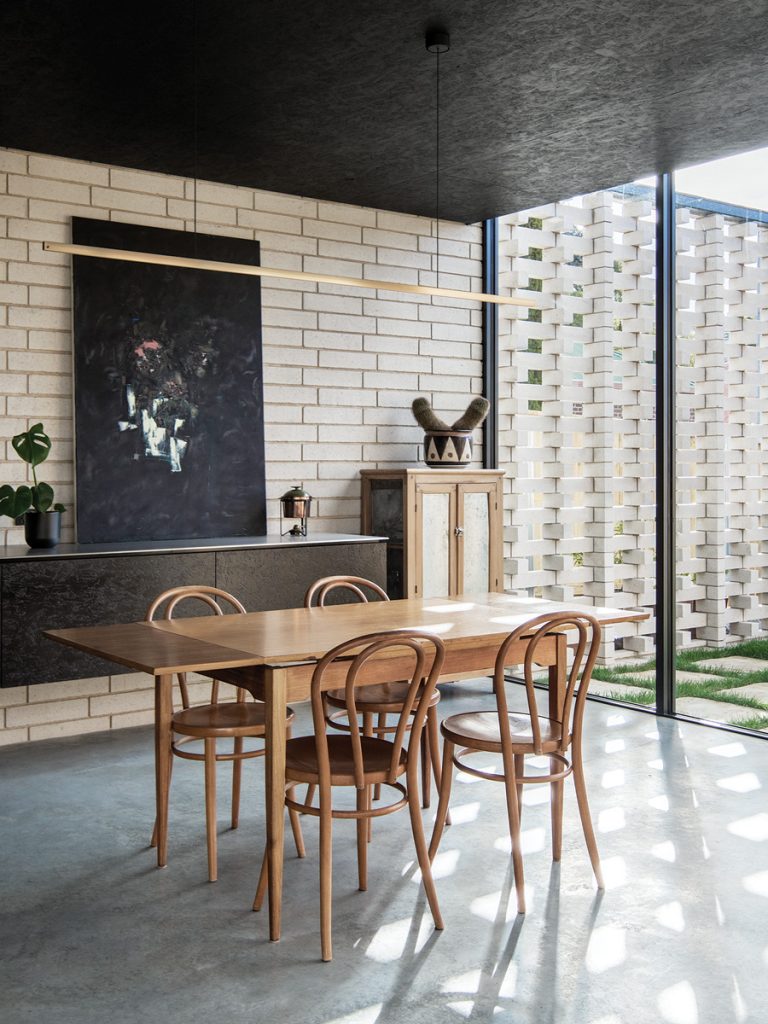
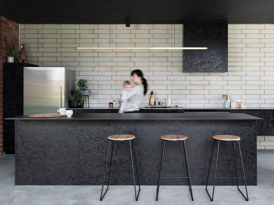
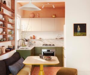
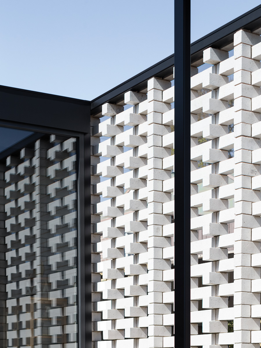
The long kitchen is enclosed on two perpendicular sides by glass sliding doors and awaits only the delivery of a bespoke dining table by a local designer/maker. The rear wall of the kitchen is white splitstone concrete brick, deliberately offset by 100 millimetres. A screening wall to the side lane continues the axis and pattern of this wall externally.
Archier has installed its own “Highline Pendant Lights”, cast towel rails and handmade benchtop basins (the result of an ongoing collaboration with ceramicist Lindsey Wherrett). All black powdercoated down-lights are surface mounted on the ceiling, ensuring room height is maximised. The use of lights in all of the new spaces is twofold: to light the working surface, but also to highlight wall textures. Spaces are demarked by floor treatment: utilitarian polished concrete in the kitchen and service rooms, and warm timber boards in the nook.
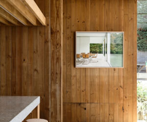
In previous projects, Archier has employed SIPS building technology; here the spaces are smaller and it was not deemed costeffective. Measures that have been implemented to reduce costs, building waste and VOCs include the use of Oriented Strand Board (OSB) to face the linear, “floating” kitchen cupboards, a simple sliding door system (a modular repetition) to draw in as much natural light as possible (even on the grey days, the internal lights are rarely needed), and careful reuse of materials wherever possible.
The effect is fluid, although Josh notes the detailing is far from simple in many unseen places, such as behind the eaves, and where the kitchen and private nook meet. The elegant ease also allows bold individual pieces, such as stunning paintings and ceramics, to glow in their respective and carefully considered placements. The result is a series of light, open spaces, which are deliberately at odds with the original house – and all needs and challenges are delightfully addressed.
Specs
Architect
Archier
Builder
Jak Allie Constructions
Passive energy design
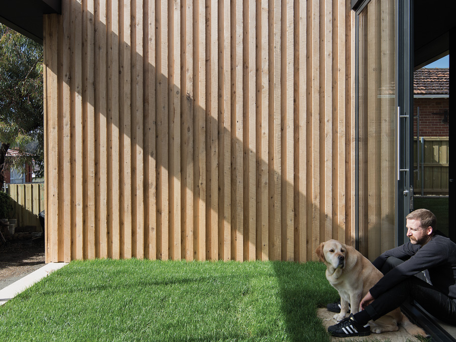
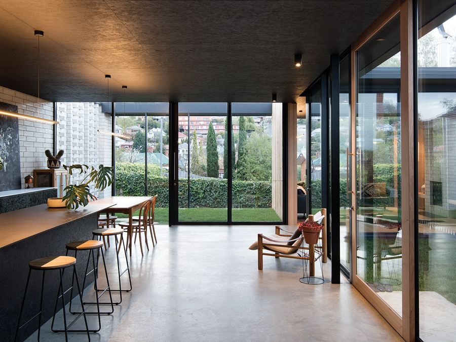
The slender roof structure projects over the northern walls to create a deep eave that shades the full-height glass in warmer months to prevent internal overheating. Operable glazing on opposing walls provides ample cross-ventilation in summer and minimises the need for mechanical cooling. Double-glazed panels are faced to the north to provide natural light and to direct sunlight onto the concrete flooring and rear brick walls through the winter months.
Materials
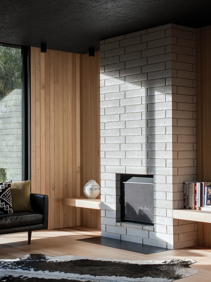
The materials (timber, concrete, steel and brick) improve with age and don’t require additional finishes. This approach is less about being raw or minimal and more about the honesty of letting materials simply be what they are. There’s a captivating narrative in the use of materials that age and change over time, as they express the occupation and use of the space. Exposing the existing brick wall of the original house builds on this idea and helps to ground the extension. It also carries the story of the original dwelling into the new house. The materials used are also durable and will stand up to years of use. In the kitchen, for example, the architects used a stainless steel sheet for the bench top. This will last for many years without showing any major signs of wear. It’s also a relatively cost-effective material and provides an ideal food preparation surface. Archier also collaborated with local makers to produce many of the brass fittings in the bathrooms, and local ceramicist Lindsey Wherrett was commissioned to make a handbasin.
Flooring
The flooring is exposed concrete and Tasmanian oak strip. The functional areas of the extension are concrete and the slab has been heavily burnished to provide a hard-wearing surface that has good thermal mass and looks great. The private nook has a Tasmanian oak timber floor. The timber helps to shift the mood in the house from being functional and utilitarian to more refined and inviting. The timber is much warmer in colour than concrete, and also warmer under foot.
Glazing
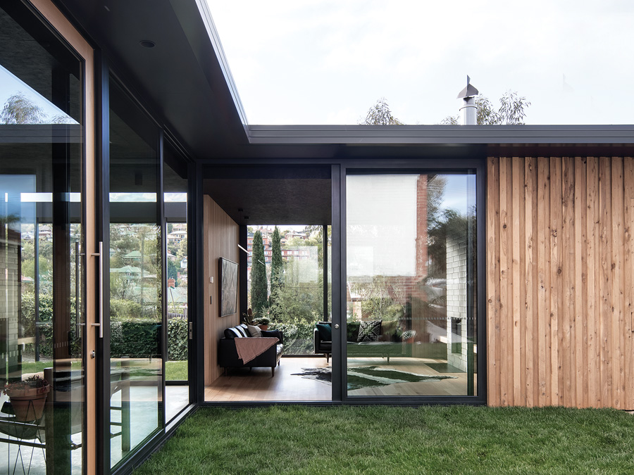
All the exterior windows are full-height and double-glazed. Capral aluminium frames were used as they provide good thermal performance. Full-height glazing extends the sense of space, particularly when it’s adjacent to an outdoor room or courtyard, whilst also providing an abundance of natural light.
Lighting
The careful placement of light helps to reduce energy consumption. The house has low-energy LED lighting throughout. LED strip pelmet lighting along the joinery core provides up-lighting and under-bench LED strips provide subtle down-lighting. Archier’s own brass “Highline Pendant Lights” illuminate the kitchen, bedroom and study.