


Dulux Reveals 2025 Colour Forecast as Nurturing & Soothing Colours Come to the Fore
IMG LINK

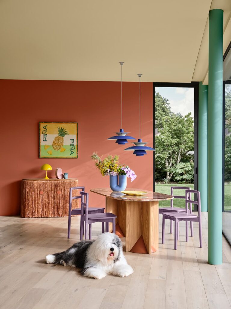
Dulux Colour Forecast 2025 - Recollect palette. Styling: Bree Leech Photographer: Lisa Cohen
IMG LINK

Dulux Colour Forecast 2025 - Recollect palette. Styling: Bree Leech Photographer: Lisa Cohen
IMG LINK

Dulux Colour Forecast 2025 - Recollect palette. Styling: Bree Leech Photographer: Lisa Cohen
Dulux has unveiled its annual Colour Forecast for 2025, which sees uplifting and soothing colours come to the fore within our homes and commercial spaces as a response to recent periods of uncertainty.
Distilled into three distinct palettes Still, Recollect and Emerge demonstrate how colours with warm, brown undertones play an important role in evoking a sense of nurture and positivity. In 2025, Dulux predicts that rich burgundies and wine hues will become more prominent throughout residential interior design, alongside an increased use of green including olive, sage and vibrant yellow-green.
Led by the Dulux Colour Team, comprising of Colour and Communications Manager Andrea Lucena-Orr, Colour Manager Lauren Treloar and Colour Forecaster Stylist Bree Leech, the annual Dulux Colour Forecast is based on year-round research into the latest global and local trends that are predicted to influence Australian interior design and how we live – and has been doing this since its inception in 1999.
“As part of this research, the Dulux Colour Team engages global and international brands, attends seminars, catwalks, product and design launches, and events such as Milan Design Week, and reviews customised research and insights sourced through Dulux’s extensive networks across the UK, Europe and Asia Pacific. As members of the Colour Marketing Group (CMG), the team also analyses current and future trend reports, including Color Hive (Mix Magazine) and LS:N International.” Treloar explains.
“During times of instability, such as the current cost-of-living crisis and ongoing overseas conflicts, reduced consumer sentiment tends to see colour trends shift less dramatically. However, colour can be a powerful antedote to lift spirits and provide a sense of comfort and warmth, which is evident with this year’s colour palettes.” Lucena-Orr adds.
Lucena-Orr further explains that Australians can feel overwhelmed due to our continual connection to the digital world and the rise of AI, which is further compounding this feeling. “There is a sense to slow down and appreciate life’s everyday moments, to look for joy in our surroundings and find comfort in reminiscing about times when we felt safe and secure. These shifts have informed the three Colour Forecast palette trends for 2025 in a way that’s relevant for Australian interiors.”
“One of the most significant shifts this year is the increase in warm neutrals across the three palettes. During uncertain times we often see a move towards muted colours and calming pastels that help make us feel grounded and provide a sense of relief from everyday stresses.”
“As a counterbalance, brighter and joyful colour is emerging as a trend, used to create expressive interiors that bring a smile to your face. Pink continues to be present, however it has a brown undertone, making it a perfect neutral base within a colour scheme and we are seeing a greater influence of lilac and purple. Cobalt blue continues to feature as an accent shade, but blue with a purple undertone is a newer direction this year.
With each palette having been expertly designed to work together cohesively Leech adds that consumers can combine colours from each palette with confidence. “As consumers turn their attention towards their home interiors and seek to make lifestyle and design changes to reflect their needs, they can look to the Dulux Colour Forecast for inspiration and feel reassured for their next project.”
STILL
Driven by our need to appreciate things in the slow lane Dulux Still has an instantly calming effect that can create a nourishing and comforting environment. Encouraging a deeper connection with nature, the palette is subdued where warm grey subtly emerges as an accent against yellow based neutrals and greens, blending with greyed off and serene cool blues.
“Dulux Still is a palette that is likely to prove popular with home enthusiasts as it features beautiful warm neutrals including Dulux Studio Cream, Dulux Clay Pipe and Dulux Mellow Beige, alongside muted darker tones, Dulux Nighthawk, Dulux Pesto and Dulux Pacific Spirit.” Lucena-Orr explains.
Leech adds that texturally, Dulux Still integrates biophilia and the use of eco-friendly, non-toxic materials and finishes, undyed textiles – design pieces developed for their circular sustainability. “Stone ceramics, wood, organic cotton, linen and hemp are seen alongside patterns that feature primitive line work style patterns. Dulux Still emphasises quality and craftsmanship, avoiding ‘flashy’ elements, instead opting for understated luxury.”
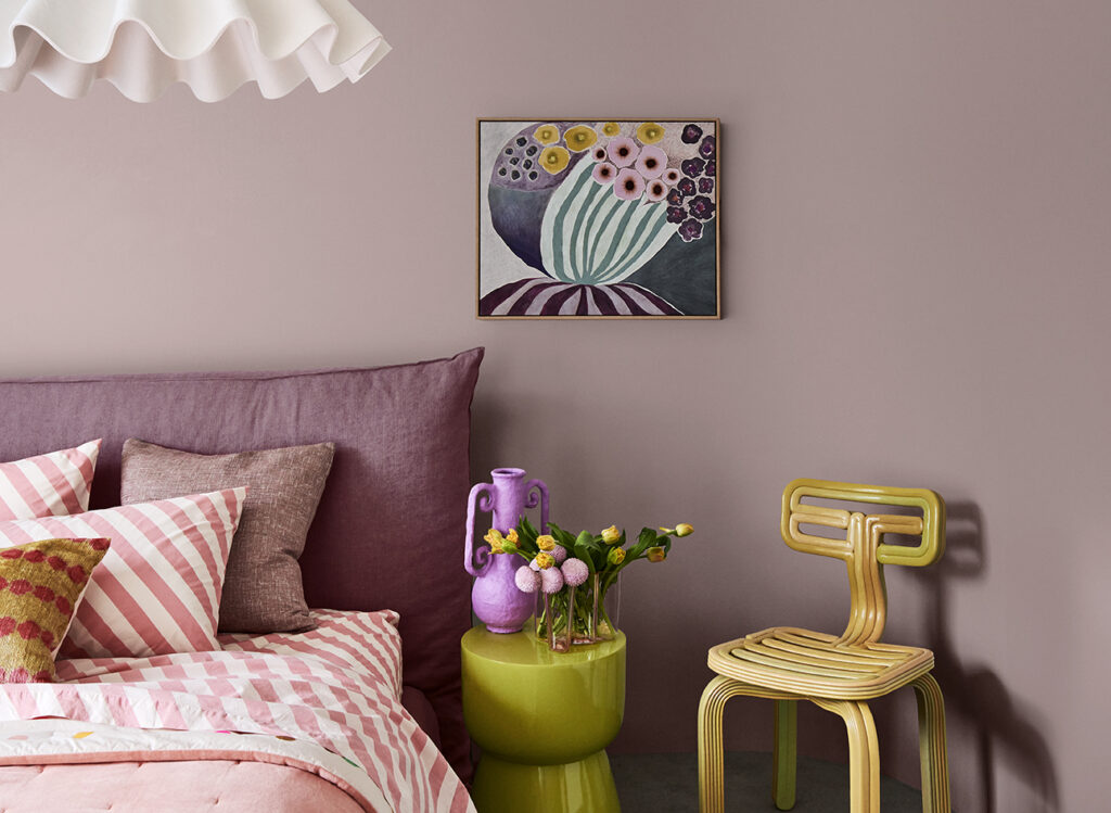
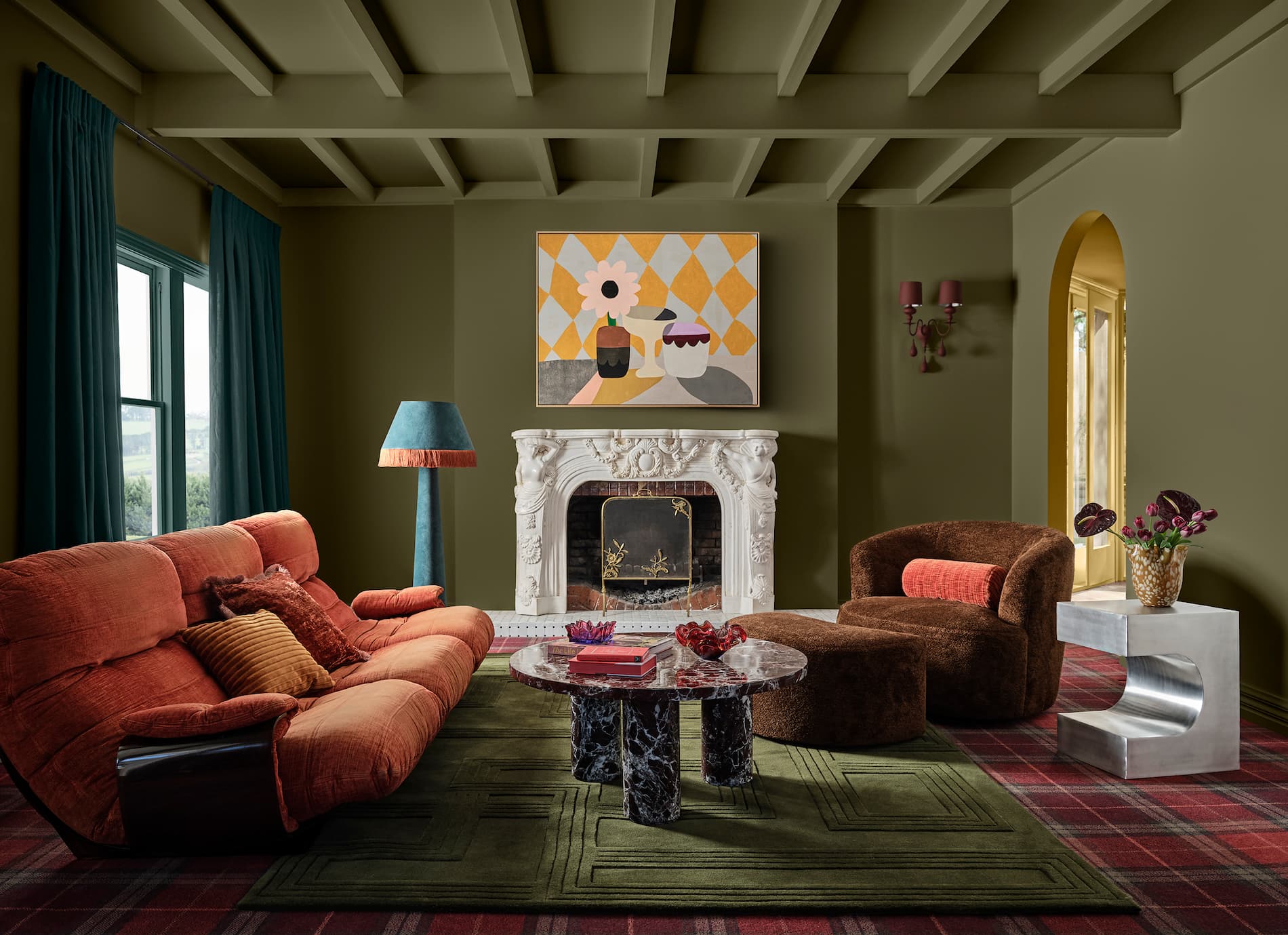
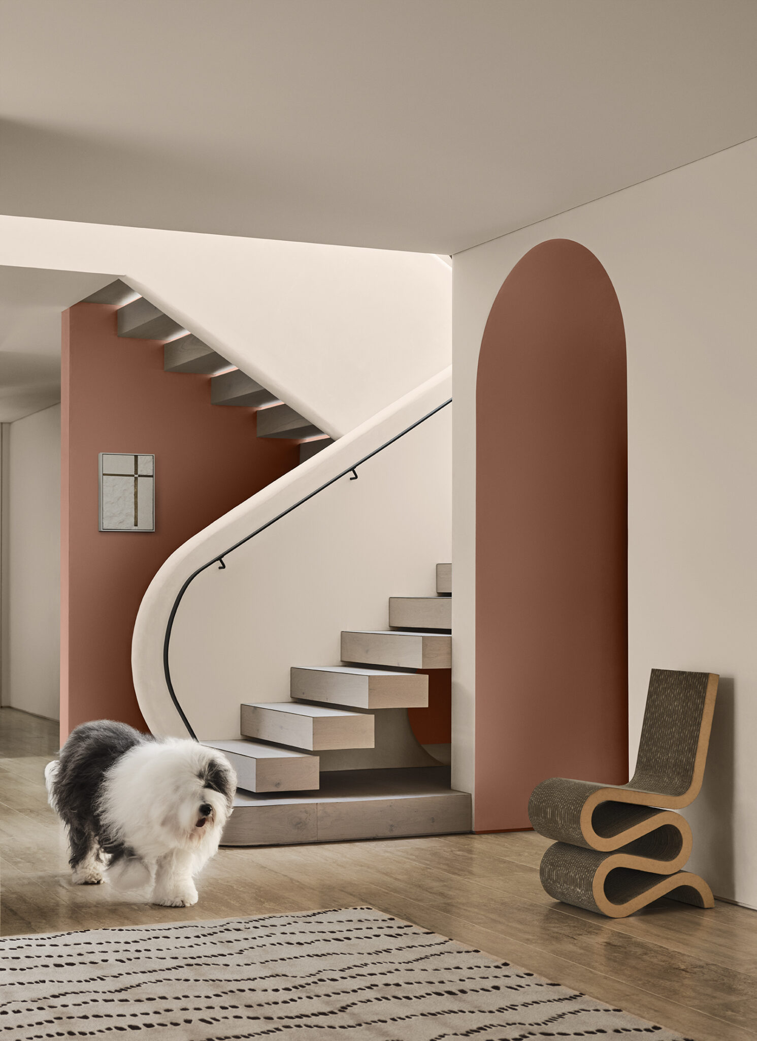
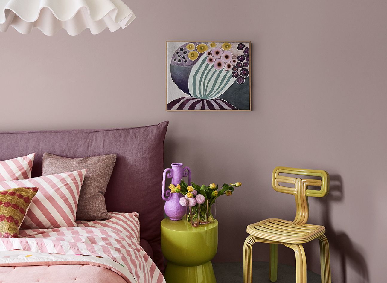
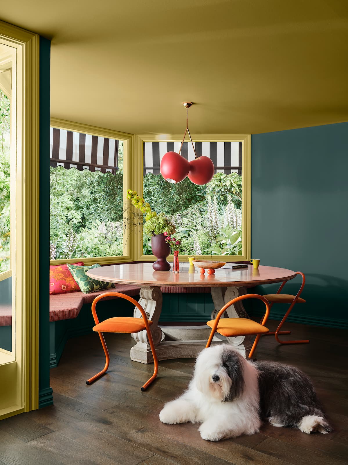
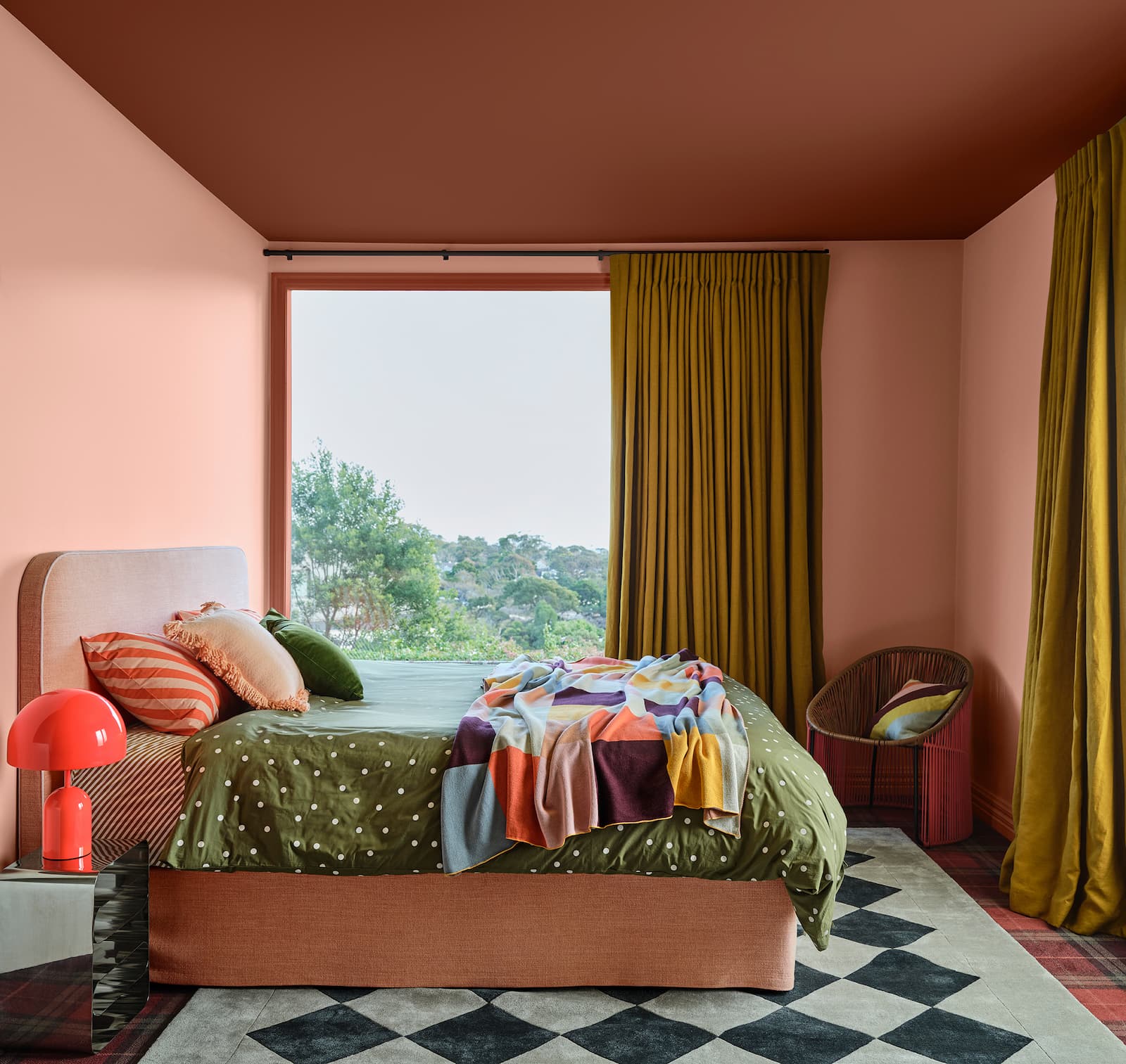
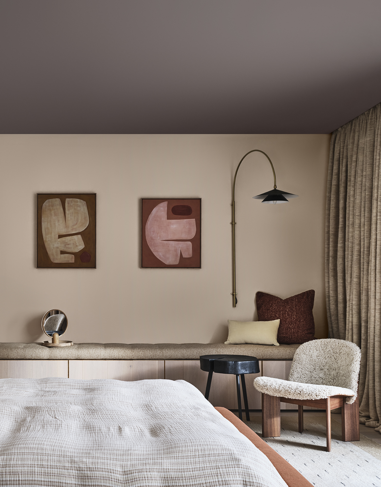
RECOLLECT
As a response to seeking comfort and security Dulux Recollect is a moodier palette that evokes a sense of nostalgia, reflection and sophistication. Yellow-based greens and deep olive shades, including Dulux Zingiber and Dulux Olive Blend, are paired alongside rich wine shades ranging from grape to plum, such as Dulux Plum Sauce and Dulux Grapeshot, which feature as key colours for both walls and accessories.
Lucena-Orr adds that Dulux Plum Sauce is an emerging colour direction we’ll be seeing more of in 2025. “It’s a colour that’s gained a much bigger personality, it’s grounded and adds a level of sophistication and a feeling of cosiness we’re searching for.”
As a response to the economic downturn, Dulux Recollect reflects both an appreciation for classic design and a desire to seek out unique vintage pieces that tell their own story, Leech explains. “Dark timbers such as walnut will feature on furniture, alongside high gloss in solid colours, coloured glass and glass brick. Texturally, we will see rich coloured fabrics with clashing patterns alongside crushed velvet, chenille and damask to evoke a feeling of opulence.”
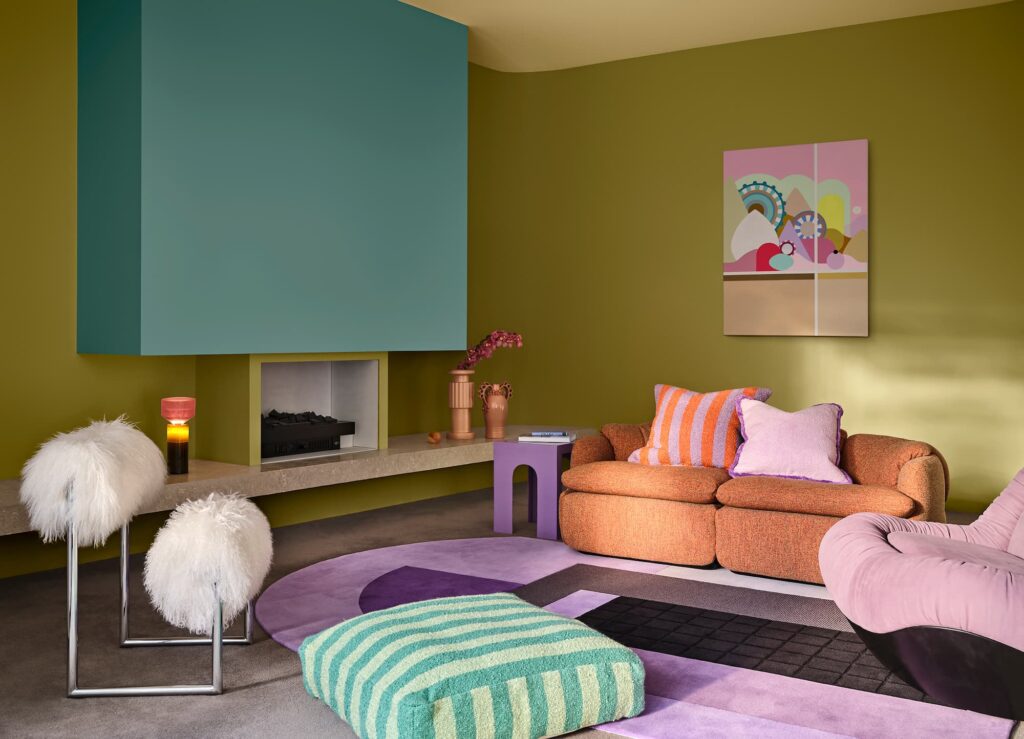
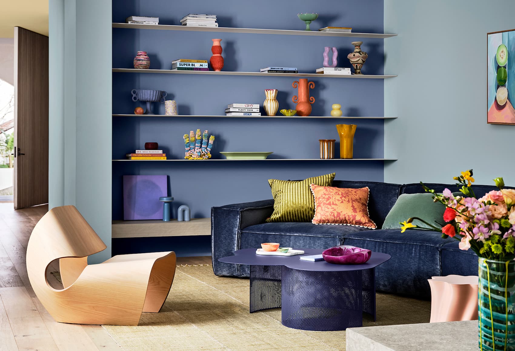
EMERGE
An uplifting palette of soft and mid-tone hues, Dulux Emerge has a feel-good energy and is filled with soft greens, mauves and a deep red to bring joy without overwhelming a space. Treloar explains “Dulux Emerge embodies individuality, inclusivity, collaboration and empathy, reflecting an expressive and eclectic style that celebrates connection.”
“Evoking a sense of cautious optimism, the Dulux Emerge palette is a balanced curation of warm muted hues including biscuit yellow, warm orange-based pinks, greyed off lilacs and a hint of brown and light grey blue.”
Dulux Emerge features soft rounded forms and expressive collections of decor that ignite feelings of joy and optimism Leech adds. “Coloured boucle, soft velvet and buttery suede set a cosy mood, whilst large-scale terrazzo brings a bold and textured statement to floors and countertops. In artwork, digital imagery and quirky florals take hold in a mix of pastel and bolder hues serving as focal points.”
Dulux Colour Forecast 2025 tips by Andrea Lucena-Orr
- When considering the use of mid-tone colours for paint, I recommend using them on all four walls – especially in bedrooms and formal living spaces. For smaller spaces you can use smaller volumes on either one or two walls.
- Don’t forget ceilings and areas such as above picture or dado rails that also work well in mid-tone hues. Doors can be a great surface to paint in Colour Forecast colours.
- With so many neutrals across this year’s palettes, consider using some of the darker colours as accents for decorative objects, textures and furniture.
- For colour accuracy, simply order Dulux A4 stickers or Sample Pots from dulux.com.au in your chosen colour(s) for your space – view these colours in your home’s natural lighting. Alternatively, Dulux has an online colour advice team and a Colour Design Service if you would like a design professional to assist in curating your space.
To learn more about Dulux’s Colour Forecast 2025 visit www.dulux.com.au
More green updates