Office Talk
Eight offices have caught our eye in the last year – because of their low-budget style, clever reinvention of materials, energy efficiency or just because they look like fun places in which to work.
Project: Assemble Studio
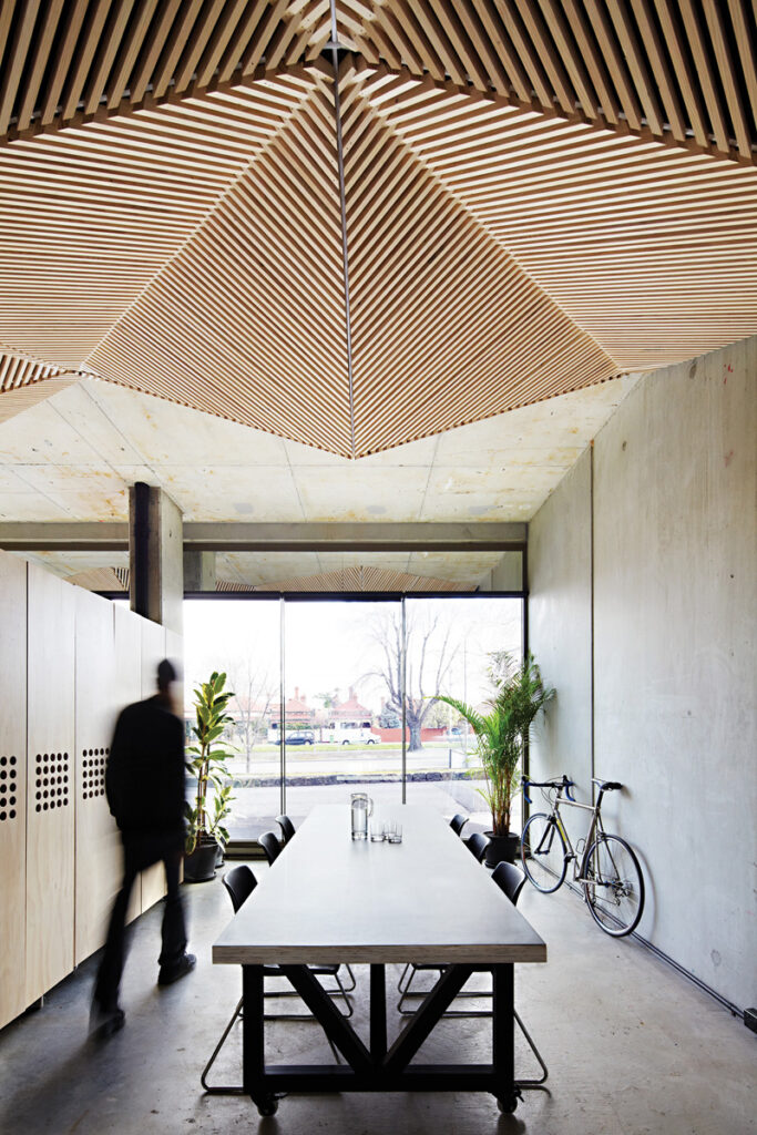
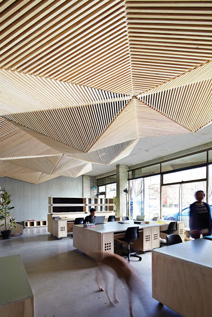
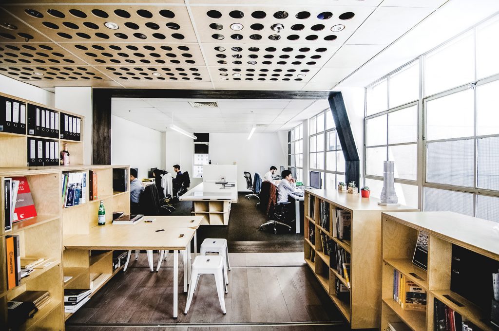
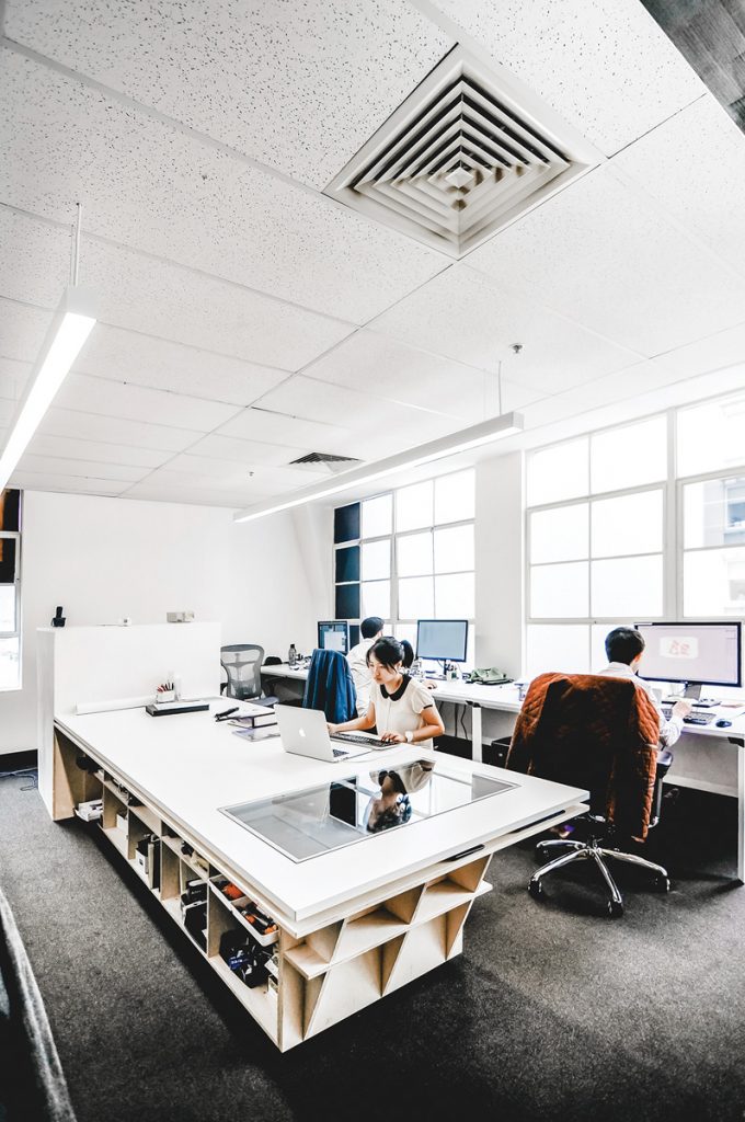
With an aim to create a low-cost, flexible and inspiring workplace Assemble decided to keep the concrete side walls and front section of the ceiling of their studio exposed, in order to benefit from the effects of thermal mass. To conceal the remainder that was cluttered with pipes, ductwork, air-conditioning units, smoke detectors and fire alarms, they created a false ceiling of origami- inspired folds of timber battens made from sustainably harvested hoop pine ply. All the custom-built furniture in the studio is on castor wheels so it can easily be shifted and the space reconfigured for events and design workshops. The desktops are finished with marmoleum, an old-fashioned flooring material made from linseed oil and natural pigments. The large windows result in the space being flooded with natural light all day, which means the studio relies very little on electric lighting.
Architect:
Assemble
assembleprojects.com.au
Project: KUD Office
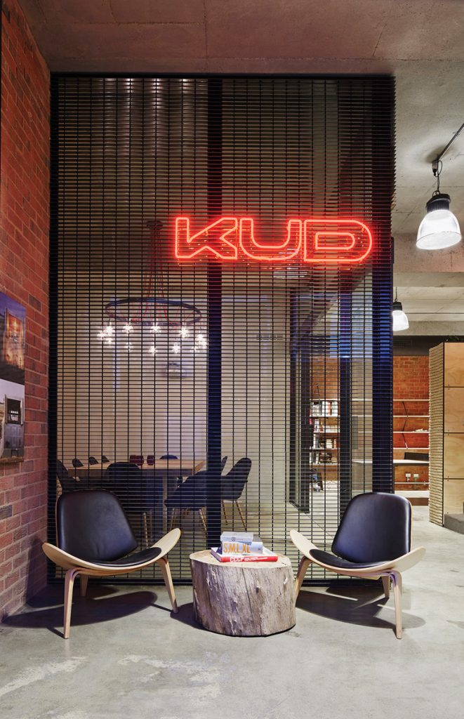
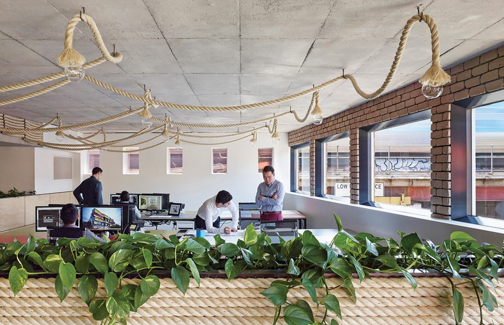
Kavellaris Urban Design (KUD) sought to use their own studio conversion as an opportunity to explore alternative spatial and material solutions for workplace design and sustainability. Stripping back the existing shell to its core structure, the industrial backdrop presented an opportunity to juxtapose this old skin with new elements. KUD introduced a new self- watering landscape wall, laminated LVL timber beams and heavy duty sisal rope as a dividing wall finish.
Visual connection between the varying programs, arranged over the split levels, allowed for the spectacle of the day- to-day operations to merge and spill over into each other. Boundaries between client, employee, private and public have been deliberately removed.
Each new element introduced has been rigorously assessed for its environmental and economical considerations and, in plan, this new office allows for flexibility in arrangement as the company grows and changes over time.
Architect:
Kavellaris Urban Design
kud.com.au
Project: Branch Studio
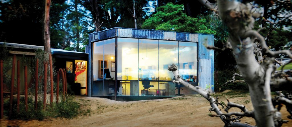
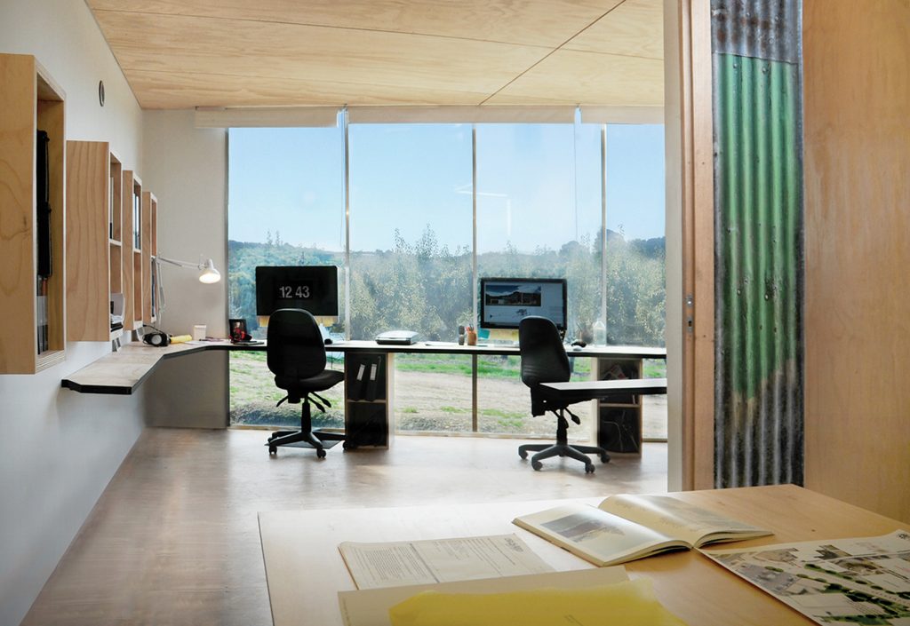
This small studio space for two architects and a landscape architect was designed to maximise views – the architects face out into the orchard and the landscape architect faces directly into a small landscaped courtyard. Where the form is solid it blocks out car parks and back-of-shed areas. Recycled corrugated iron was collected from the paddocks surrounding the project site and composed as a façade treatment in contrast with a “thin” glazing system (salvaged and recycled from an old job) to create a minimal threshold between desks and the orchard. Joinery is carved out and continuous in form to create a work station with desks, benches 4 and a cantilevered model display bench. A series of layered plywood boxes are “tucked” into wall cavities between studs to form book and folder storage.
Architect:
Branch Studio Architects
branchstudioarchitects.com
Project: Port Phillip Community Group Offices
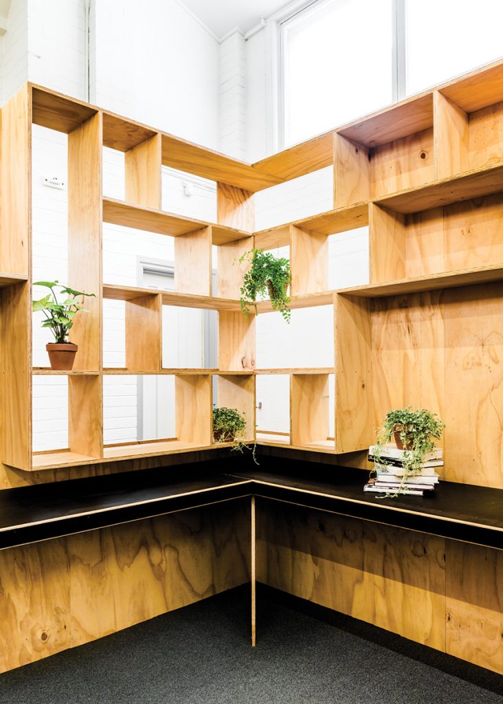
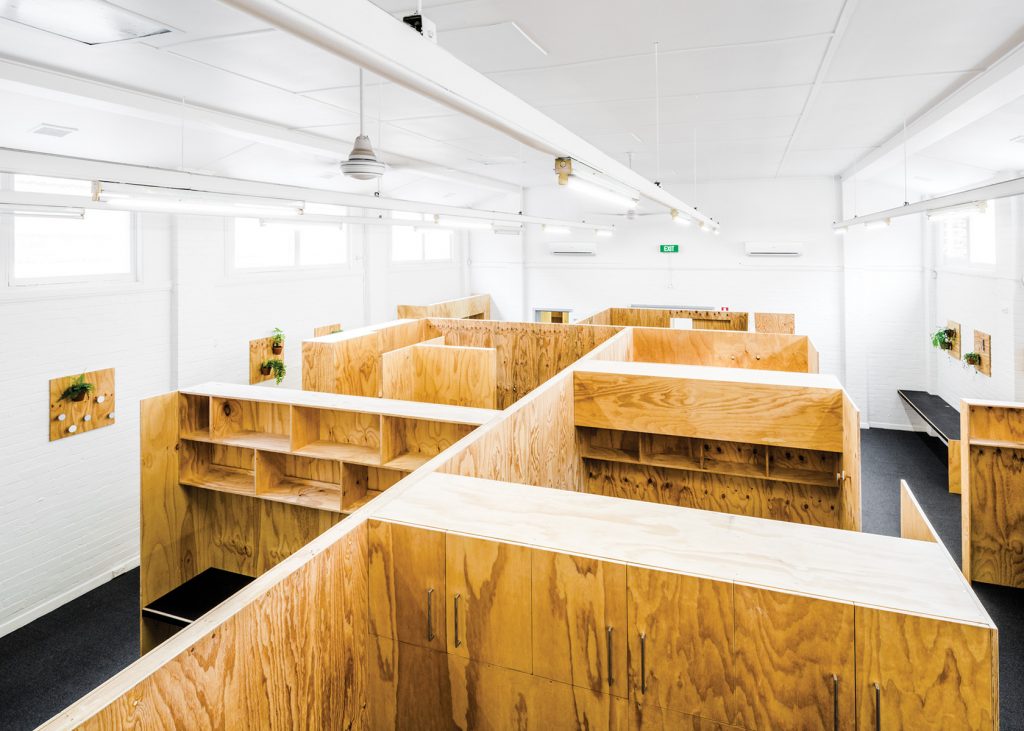
With a limited budget the core design principles were to provide a new office environment that was light filled and calming for both staff and their clients. Structural plywood was the primary building material; with this robust timber, the carpenters have crafted a series of joinery items that are innovative and resourceful. Using the modular dimensions of a conventional sheet of plywood to construct wall cladding, workstation desks, shelving and cupboards, the project generated very little waste – only a trailer load. Many small items such as furniture, fixtures, as well as the project team’s time had been donated to this special cause.
The simple strategy of sealing the old building’s wall and roof vents have contributed to more consistent room temperatures, whereby ceiling fans and louvre windows are effective in circulating fresh airflow. LED batten lighting has replaced old fluoro battens and the lighting supplier has calculated that the annual energy costs for lighting will be one third of the client’s current expenditure. Long- term energy savings will amount to 60% savings over a 10-year period.
Architect:
Freadman White
freadmanwhite.com
Project: Particular Studio
Located in the heart of Melbourne, the small studio space for architecture practice Particular has been an exercise in creating a space of many places – to be big and small, to rove from solo to team, to crowd without losing the sense of generosity and openness. The studio space is designed as two opposing and contrasting halves. The Work Floor is treated in utilitarian and conventional finishes – acoustic panelled ceiling, painted walls and carpet flooring. This half of the studio space serves as the formal “office” for a team of six architects. It consists of two banks of three workstations, facing in opposite directions, separated by a communal work bench. The Transformer forms the other half of the studio space and is marked by a stained timber “boundary”. In stark contrast to the neutral Work Floor, rich natural timber with exposed end grains and texture is employed, providing a tactile overtone to the space.
Inspired by the micro living units in Hong Kong, the space is populated with a series of track-mounted plywood bookcases, which serve as storage, display units and also as dividers. Custom desk panels have been designed to nestle into rebates in the shelves, creating increased desk capacity during peak project load periods. The Transformer is shapeshifter,highly flexible and modular without being generic, an infrastructure for creating many spaces.
Architect:
Particular
particular.ch
Project: Pensar Office
Pensar, a Brisbane-based construction firm, wanted an office that reflected their brand: experienced, energetic, inventive and socially responsible. The fit-out of an existing building experimented with economical but bespoke concepts, such as exposed stud walls, which reflect local construction methods. Much of the custom-made furniture is designed by Marc & Co, including the meeting tables, which are laser cut from single pieces of plywood and assembled with expressed joints. The fit- out also included the beginnings of an art collection to replace the collection of signed football jerseys. The architects acquired work from local artists, such as Veron Ah Kee, that the company can add to over time.
Architect:
Marc & Co
marcandco.com.au
Project: Archae-Aus office, Dalkeith House
VittinoAshe Architects was commissioned to assess and propose a respectful and responsive design for this office fit-out. The response was a balanced interpretation between stripping back to reveal inherent beauties (such as the floorboards), identifying and highlighting existing idiosyncratic features (from all eras and occupants) and, through the intervention, delicately adding another contemporary layer of history to what already exists, thus creating an ongoing story for this unique place and the Fremantle community. The fit-out of Dalkeith House is a controlled and minimal intervention that seeks to amplify existing conditions. Vintage bottles were sourced and re-blown for the lighting strategy as well as secondhand furniture for all non-work related pieces. It is an attempt to reduce built work, in order to not only reduce cost and time but as a response to augment and enhance the context within.
Architect:
VittinoAshe Architects
vittinoashe.com.au
Project: Room 11 Office
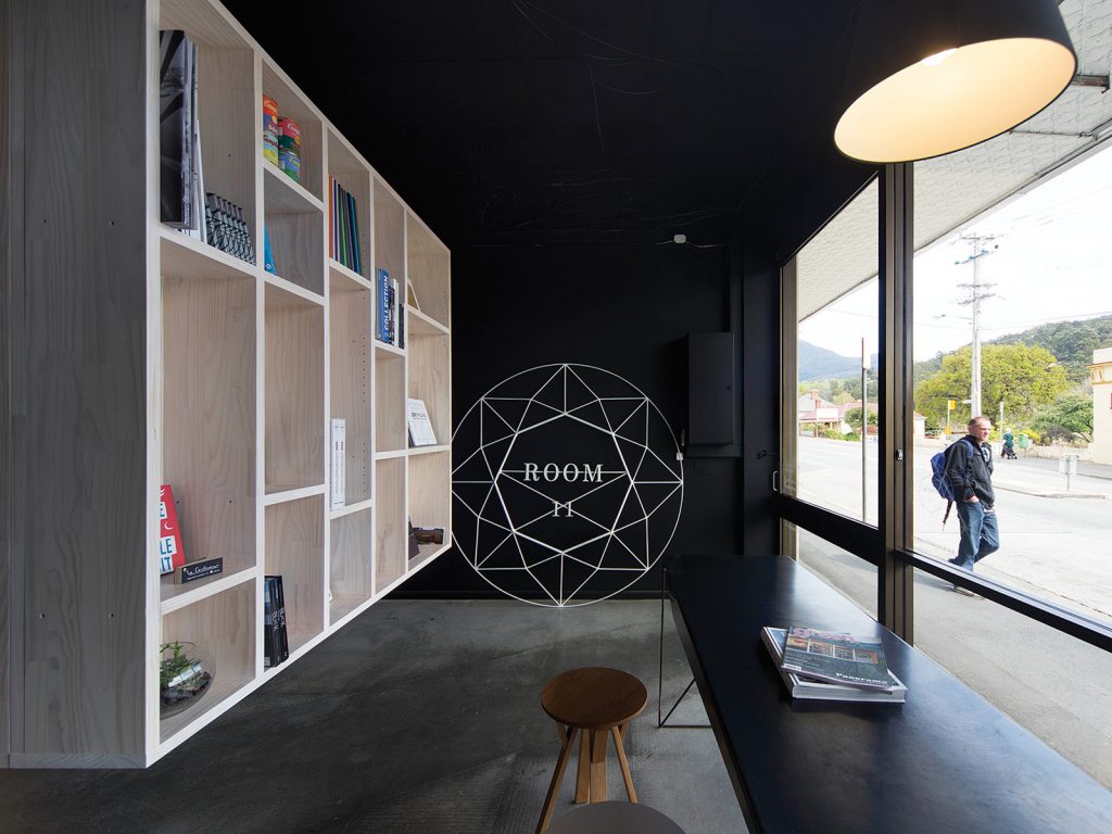
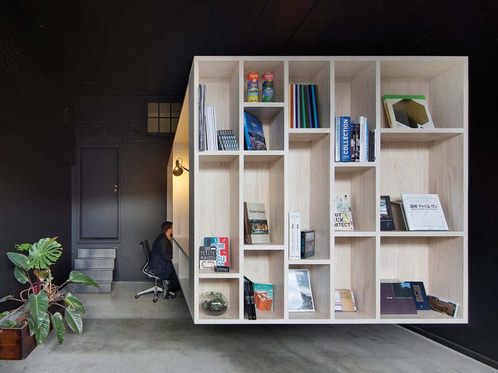
This project revolved around making a presentable workspace within a small shopfront, that could also address the street, and provide a potential retail opportunity, so that the architects’ office could double as a bookstore. This provides an informal relationship with the local community, an activated front of house.
The fit-out revolves around the creation of four workspaces, three of which are standing desks. A simple strategy was adopted in stripping back all the existing structure to a basic shell, exposing the original volume and ceiling details, and painting the walls and ceiling black. The timber workstation then hovers in this space, cantilevered off a central column so that it appears to be floating. A folded steel plate set of stairs links the shopfront to the back-of-house, and a bespoke folded mild steel table sits in the front of the space to serve as a meeting room. The project uses basic off-the-shelf laminated finger-jointed pine panels, a re-used steel beam found on-site and custom folded mild steel stairs. It is passively heated through solar orientation and was completed on a very tight budget and timeframe.
Architect:
Room 11
room11.com.au
