
Winners announced in 30th year of Dulux Colour Awards
A new benchmark for colour usage has been set by the 2016 Dulux Colour Awards winners, announced on Thursday 28 April at Melbourne’s Myer Mural Hall.
Boundaries were pushed across all categories, with colour used in daring yet cleverly considered ways to transform spaces. Judges were unanimously impressed by the sense of storytelling through colour and projects which showcased fresh combinations of hues to create unique and inspiring environments.
In its milestone 30th year, the iconic program has acknowledged and celebrated those who have contributed to a colour journey over the last three decades, with a nod to the future as the journey continues. Fittingly, this year’s winning projects reflected an evolution of colour, with retro elements intermixed with forward-thinking palettes.
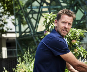
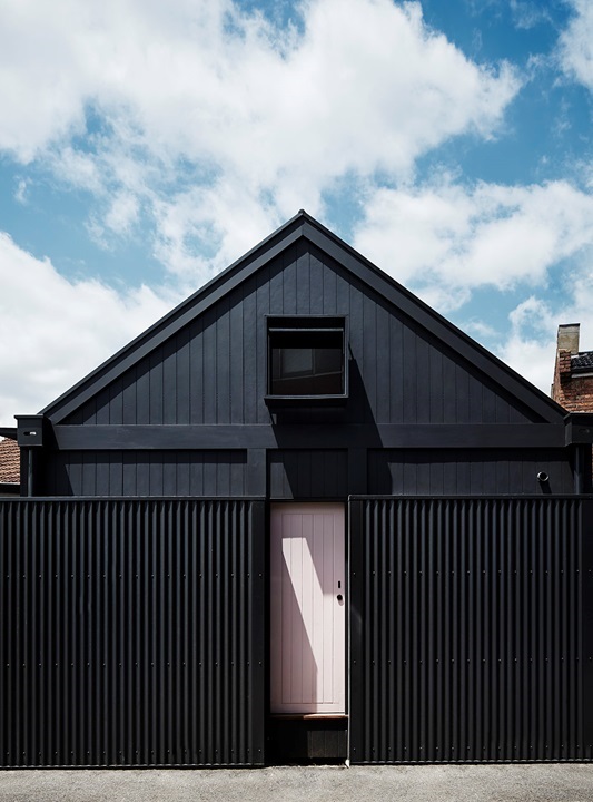
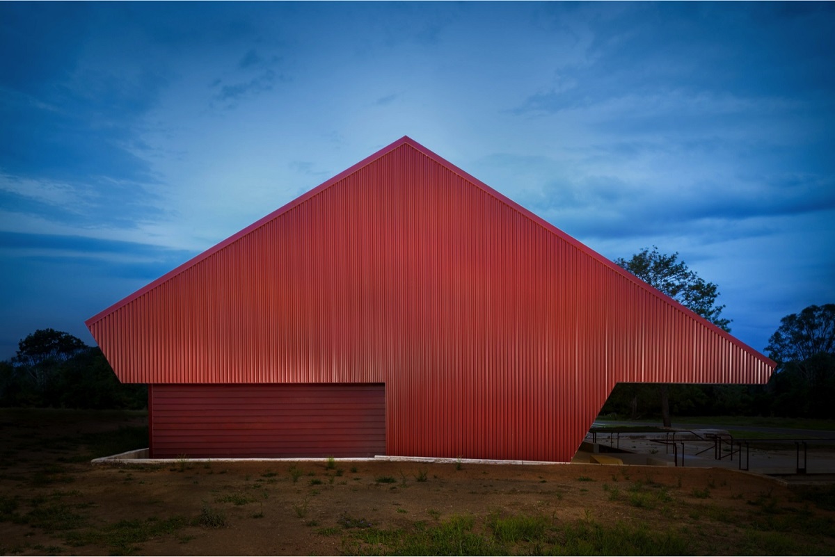
This year’s standout project was The Condensery by PHAB Architects which took out the Grand Prix prize – winning the Commercial Exterior category and Highly Commended in the Commercial Interior (Public Spaces and Hospitality) category. Applauded for its exceptionally clever application of a sole colour in varying shades, The Condensery was seamlessly executed to achieve a beautiful continuity both inside and out.
The judging panel in the 2016 Dulux Colour Awards including highly-regarded design industry leaders from a range of disciplines:
- Meryl Hare – Principal at Hare + Klein Interior Design
- Clare Cousins – Director at Clare Cousins Architects
- James Harper – Principal at BrookingHarper and Director at Design Institute of Australia
- Matt Gibson – Director at Matt Gibson Architecture + Design
- Alex Fulton – Director at Alex Fulton Design (NZ)
The 2016 Dulux Colour Awards winners are:
1. Grand Prix
Project: The Condensery – Somerset Regional Art Gallery Architect: PHAB Architects
Judging panel comment: This project was awarded for its exceptionally clever application of a sole colour in varying shades, seamlessly executed to showcase a beautiful continuity both inside and out. Using an array of reds to tempt any palette from deep oxides to reddish pinks, results in incredible beauty against the rural landscape. The Condensery tells a fascinating, layered story, whilst honouring the original architecture and history of the building. The exterior and interior work in complete harmony with each other, using traditional and contemporary colours in an equally brave and restrained manner, achieving perfect balance and a building for future generations to appreciate. The Condensery features Dulux Lime White, Dulux Bombay Pink, Dulux Red Leather, Dulux Deep Garnet, Dulux Indian Red, Dulux Red Oxide, Dulux Deep Leather.
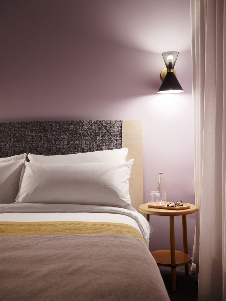
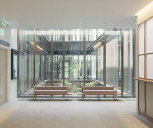
2. Commercial Interior (Public Spaces & Hospitality)
Project: Alex Hotel Architect: Arent & Pyke
Judging panel comment:
The Alex Hotel is an example of how a strategic yet subtle approach to colour can result in effortless sophistication. Raw and refined, a beautiful, unusual palette evokes a sense of relaxation and serenity with clever and well thought out precision, creating a homely and immersive environment. Arent & Pyke has committed and executed a colour palette that could have been disastrous in the wrong hands! Alex Hotel features Dulux Rosetta, Dulux Ginger Crunch, Dulux Dreamland, Dulux Deep Sun, Dulux Amazon Depths, Dulux Vivid White, Dulux Grey Pebble, Dulux Tranquil Green.
3. Commercial Interior (Office Fitout & Retail)
Project: The Doctor’s Studio Architect: Russell & George
Judging panel comment:
The Doctor’s Studio is an extremely forward thinking and provocative project that pushes the boundaries with an original display of colour with an uplifting palette. Russell & George has shown a true commitment to colours throughout the interior in a very luxurious manner, achieving an effortlessly unique and natural look. A combination rarely put together so successfully, The Doctor’s Studio really is a new, fresh take on a clinical interior. The Doctor’s Studio features Dulux Tuscan Sunset, Dulux Sea Radish, Dulux Natural Light.
4. Commercial Exterior
Project: The Condensery Architect: PHAB Architects
Judging panel comment:
As above.
5. Single Residential Interior
Project: Normanby Architect: Whiting Architects
Judging panel comment:
Normanby is a courageous project which showcases a perfectly crafted, clever use of colour using pastel hues with natural materials and bold colour in exactly the right proportion. The daring use of colour compliments and highlights the natural mix of materials in the home including leather and wood. Using what typically could be jarring combination of hues, this original palette subtly defines spaces within the home. Normanby features Dulux Lexicon Quarter, Dulux Domino, Dulux Marshmallow Quarter, Dulux Icepack Quarter, Dulux Deluxe Days.
6. Single Residential Exterior
Project: O’Grady Architect: Whiting Architects
Judging panel comment:
The restrained and unique palette used for O’Grady achieves a perfect balance between colours defining two periods. The exterior has an urban feel with a masculine mood in Dulux Domino adding drama in the entrance with a contrasting pastel. The project displays refinement with an edge! O’Grady features Dulux Ghosting, Dulux Hugo Double, Dulux Lexicon Quarter, Dulux Domino, Dulux Mudpack.
7. Multi Residential Interior
Project: Holman Hall, Monash University Architect: Hayball & Richard Middleton Architects
Judging panel comment:
Hayball & Richard Middleton Architects has exhibited a very sympathetic use of colour throughout this space, with careful consideration of the building’s aspects. The colours, featuring in student rooms, are used with purpose to create a sense of harmonious personalisation and functionality. The variety of powder coated finishes works beautifully alongside timber grains with a wash of colour. Holman Hall features Dulux Natural Light, Dulux Glowing Coals, Dulux Chimes, Dulux Black Satin, Dulux Signal Red.
8. Multi Residential Exterior
Project: Logan Hall, Monash University Architect: McBride Charles Ryan
Judging panel comment:
Logan Hall boasts great use of monochromatic colour to highlight articulation in facade. The combination of coloured glazed bricks with a simple palette creates a harmonious and amazing combination, setting a new benchmark for multi-residential exteriors. Natural light add shadows and depth in colours as light shifts across the day. Colour repetition is cleverly broken up in exterior pattern stating the skilful value of good design
8. Installation & Events
Project: Masterpieces from the Hermitage Architect: National Gallery of Victoria
Judging panel comment:
Masterpieces from the Hermitage exhibition is a well-orchestrated standout on how bold and defined colour can really transform and enhance a gallery exhibition. As traditional gallery spaces display white backdrops, these spectacular and authentic colours brings the art to life and transports you in to another world.
9. International
Project: Empire Cinema Architect/Design Practice: ArcHaus
Judging panel comment:
One of the most impressive before and after restorations, the Empire Cinema is a great example of an inspiring conservation project that has been transformed using colour dedication. The bold palette respects the heart of the old building with colours that revitalise and create an iconic, Baz Lurman’esque, vibe. ArcHaus has embraced the era, celebrating the buildings theatrical presence and function. Empire Cinema features Dulux Cherry Wood, Dulux Maheono Half, Dulux Masterton.
10. Student
Project: Infinite Mulligan Architect/Design Practice: Kei Jin Pook (RMIT)
Judging panel comment:
Vibrant and lively, this project cleverly references local sporting teams in the colour palette. Using a playful and bold use of colour, Infinite Mulligan celebrates the conceptual possibilities without taking itself too seriously. Infinte Mulligan features Dulux Pink Quince, Dulux Lickedy Lick, Dulux Paris Pink, Dulux Golden Banner, Dulux Aqua Blue, Dulux Federation Red.
More green updates